CSS TRICKS FOR DUDA WEBSITES
Copy. Paste. Wowwwww.
Create stunning CSS effects with our interactive generator. Perfect for modern web design — no complex coding, just visual tools, instant previews, and clean CSS output.
Documentation
Tool
We've listed the code documentation below.
Implementation
The CSS Generator Tool creates modern CSS effects through an interactive interface with real-time preview. Users adjust controls to customize effects, see live results, and copy clean CSS code ready for Duda's editor. The tool features four distinct effect types: glassmorphism for frosted glass appearances, clip-path for geometric shapes, gradients for color transitions, and 3D transforms for perspective effects.
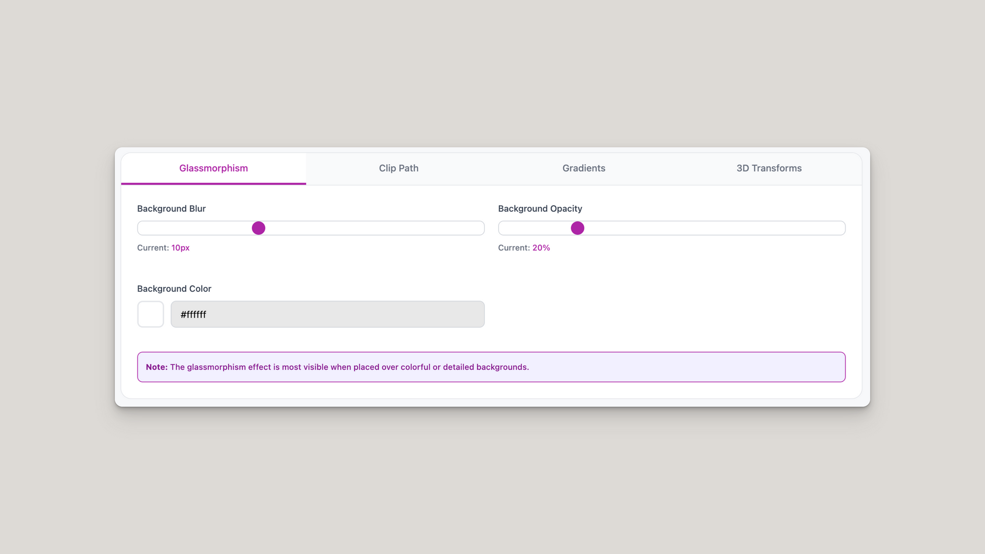
Glassmorphism Effect
Creates a frosted glass appearance using backdrop filters and transparency:
- Core properties:
- backdrop-filter: blur(10px) creates the blur effect behind the element
- -webkit-backdrop-filter: blur(10px) provides Safari/webkit browser support
- background: rgba(255, 255, 255, 0.2) applies semi-transparent background
- border: 1px solid rgba(255, 255, 255, 0.2) adds subtle white border
- Control ranges:
- Background blur: 0px to 30px
- Background opacity: 0% to 100%
- Any hex color converts to rgba() format automatically
- Best practices:
- Works best over colorful or detailed backgrounds
- Keep opacity between 10% and 40% for optimal glass effect
- Higher blur values create stronger frosted appearance
- Modern browsers required for backdrop-filter support
Clip Path Shapes
Masks elements into geometric shapes using CSS clip-path property:
- Shape definitions:
- Circle: clip-path: circle(50% at 50% 50%)
- Ellipse: clip-path: ellipse(50% 40% at 50% 50%)
- Triangle: clip-path: polygon(50% 0%, 0% 100%, 100% 100%)
- Diamond: clip-path: polygon(50% 0%, 100% 50%, 50% 100%, 0% 50%)
- Pentagon: clip-path: polygon(50% 0%, 100% 38%, 82% 100%, 18% 100%, 0% 38%)
- Hexagon: clip-path: polygon(25% 0%, 75% 0%, 100% 50%, 75% 100%, 25% 100%, 0% 50%)
- Star: clip-path: polygon(50% 0%, 61% 35%, 98% 35%, 68% 57%, 79% 91%, 50% 70%, 21% 91%, 32% 57%, 2% 35%, 39% 35%)
- Custom polygon syntax:
- Format: polygon(x1% y1%, x2% y2%, x3% y3%)
- Coordinates use percentages for responsive scaling
- Points connect in order to create closed shape
- Always includes -webkit-clip-path for compatibility
- Usage considerations:
- Content outside the path becomes invisible
- Affects element's clickable area
- Works on any HTML element including images
- No performance impact as it's GPU-accelerated
Gradient Backgrounds
Creates smooth color transitions using CSS gradient functions:
- Linear gradients:
- Syntax: background: linear-gradient(45deg, #ad24a6, #c72dbc)
- Angle range: 0deg to 360deg
- Direction flows from first color to second color
- 0deg points upward, angles increase clockwise
- Radial gradients:
- Syntax: background: radial-gradient(circle, #ad24a6, #c72dbc)
- Always uses circle shape for consistency
- Transitions from center outward
- Center color appears at element's center point
- Conic gradients:
- Syntax: background: conic-gradient(from 45deg, #ad24a6, #c72dbc)
- Rotates around center point
- Starting angle uses from Xdeg syntax
- Creates pie-chart-like color transitions
3D Transform Effects
Applies perspective and rotation for three-dimensional appearance:
- Transform syntax:
- Full property: transform: perspective(1000px) rotateX(0deg) rotateY(0deg) rotateZ(0deg)
- transform-style: preserve-3d maintains 3D space for children
- transition: transform 0.6s cubic-bezier(0.4, 0, 0.2, 1) for smooth animation
- Rotation axes:
- rotateX() : Tilts forward/backward (range: -180deg to 180deg )
- rotateY() : Spins left/right (range: -180deg to 180deg )
- rotateZ() : Rotates clockwise/counter (range: -180deg to 180deg )
- Perspective values:
- Range: 100px to 2000px
- Lower values (near 100px ) create dramatic 3D effect
- Higher values (near 2000px ) create subtle depth
- Must be first in transform chain for proper rendering
Duda Integration
Properly implementing generated CSS in Duda's editor:
- CSS placement:
- Right-click element in Duda and select "Edit CSS"
- Locate the opening { bracket
- Paste generated CSS between { and }
- Never modify the selector before the bracket
- Selector examples:
- Typical format: #dm .dmInner div.u_1264249989 { }
- May vary: #dm .p_hfcontainer div.u_1234567890 { }
- Always preserve the entire selector as-is
- Multiple effects:
- Can combine properties from different effects
- Gradients work with clip-path shapes
- Transforms can be applied to glassmorphism elements
- Order matters: place transform properties together
Performance Optimization
Ensuring smooth performance across devices:
- Effect performance impact:
- Gradients: Minimal impact, fully GPU-accelerated
- Clip-path: No performance cost, calculated once
- 3D transforms: GPU-accelerated, very efficient
- Glassmorphism: Higher cost due to backdrop-filter
- Best practices:
- Limit glassmorphism to 2-3 elements per page
- Use will-change: transform for animated transforms
- Avoid animating clip-path shapes (recalculation cost)
- Test on mobile devices for backdrop-filter performance
- Browser support:
- All effects work in Chrome, Firefox, Safari, Edge
- Backdrop-filter requires Safari 9+ or Chrome 76+
- Conic gradients need Chrome 69+ or Safari 12.1+
- Always included vendor prefixes ensure compatibility
Where to Put Your CSS in Duda
The Simple Rule: Always place your CSS code between the curly brackets { }
What this means:
- • The # symbol and everything before the { is a "selector" - it tells the CSS which element to style
- • Duda automatically creates this selector based on which element you right-clicked
- • Never delete the selector or brackets- just add your CSS between the { }
- • If what you see looks different from this example, that's fine - just find the { } and add your code inside
Note: The glassmorphism effect is most visible when placed over colorful or detailed backgrounds.
Live Preview
Preview Element
This is how your CSS will look!
Generated CSS Code
💡 How to use: Copy the CSS code below and paste it between the curly brackets { } in Duda's CSS editor.
/* Your generated CSS will appear here */
Resource Details:
The CSS Generator Tool creates modern CSS effects with real-time preview and clean code output. Perfect for Duda users who want professional styling without complex coding.
Last Updated:
July 16th 2025
Category:
CSS Tricks