Member
Account Settings
Share AgencyGenius
Know someone who might benefit from AgencyGenius? We'd love it if you shared our platform with your networking group!

Documentation
Tool
We've listed the documentation below.
Implementation
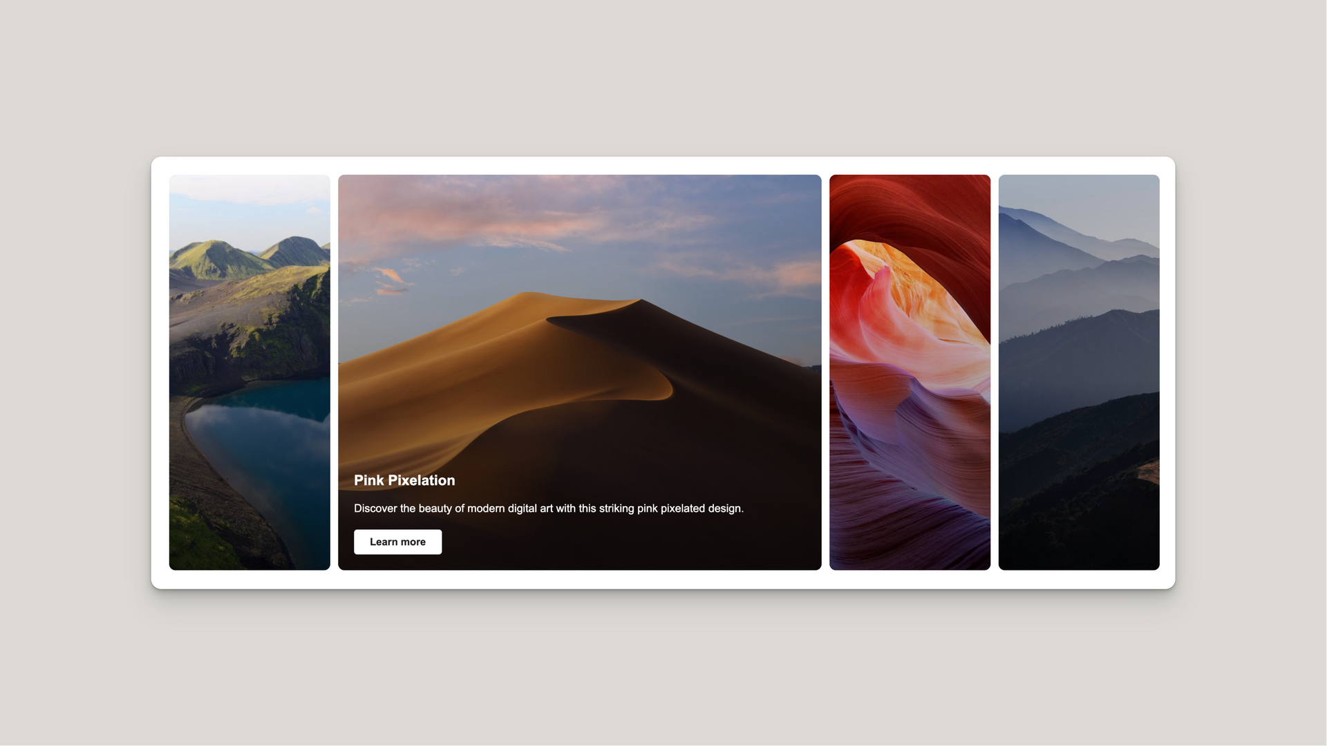
The Expanding Cards Widget creates an interactive gallery with smooth transitions between cards. When a user clicks on a card, it expands while others contract, revealing content with elegant fade-in animations. The widget features responsive design that adapts from a horizontal layout on desktop to a vertical layout on mobile devices, plus autoplay functionality that cycles through cards automatically.
HTML Structure
Use the provided HTML structure:
- The main container .expanding-cards holds all card elements
- Each card is an .expanding-card div with a background image
- The first card should have the .active class applied initially
- Each card contains a .card-content
div with:
- A title .card-title
- A description .card-description
- A call-to-action button .card-button
CSS Styling
The CSS manages layout, transitions, and responsiveness:
- Desktop layout:
- Uses flexbox ( display: flex ) for horizontal card layout
- Active cards expand using flex: 3 while inactive cards use flex: 1
- Content positioned absolutely at the bottom of each card
- Mobile layout (under 767px):
- Switches to vertical layout with flex-direction: column
- Cards have defined heights (80px collapsed, 300px expanded)
- Content uses relative positioning with flex layout
- Visual enhancements:
- Gradient overlay ( ::before pseudo-element) for better text readability
- Rounded corners with border-radius: 8px
- Smooth transitions using cubic-bezier timing function
- Animation sequence:
- Card expands/contracts with transition: all 0.6s
- Content fades in with transition-delay: 0.4s after expansion
- Content fades out immediately when card contracts
JavaScript Functionality
The JavaScript handles interactions and animation control:
- Configuration object:
- autoplay: true - Enable/disable automatic cycling
- autoplayDelay: 3000 - Time in milliseconds between transitions
- pauseOnHover: true - Pause autoplay when hovering over widget
- Core functionality:
- Initialization ensures only one card is active at startup
- Click handlers manage active state transitions with debouncing
- Autoplay logic cycles through cards at regular intervals
- Hover detection pauses/resumes autoplay when appropriate
- State management:
- isTransitioning flag prevents multiple transitions at once
- isHovering tracks mouse hover state
- Proper timing synchronization between CSS and JS transitions
Customization Tips
You can easily customize various aspects of the widget:
- Card content:
- Add or remove card elements in the HTML
- Modify background images, titles, descriptions, and button text
- Animation and sizing:
- Change flex: 3 value for active cards to adjust expansion ratio
- Modify height: 500px for desktop and height: 300px for mobile expanded height
- Adjust transition timing ( transition: all 0.6s and corresponding JavaScript timeouts)
- Autoplay behavior:
- Update config.autoplay to enable/disable automatic cycling
- Change config.autoplayDelay to control cycle speed
- Toggle config.pauseOnHover to control hover behavior
- Visual styling:
- Customize border-radius for more/less rounded corners
- Modify the gradient overlay values in .expanding-card::before
- Change button styling through .card-button properties
Mobile Optimization
The widget features specific mobile enhancements:
- Responsive layout changes:
- Vertical stacking with flex-direction: column
- Compact card heights for collapsed state (80px)
- Taller expanded state (300px) for proper content visibility
- Content visibility:
- Titles always visible on all cards using display: block
- Description and buttons only visible on active card with display: none/block
- Content placement adjusted to ensure proper visibility
- Touch optimizations:
- Larger touch targets for better mobile usability
- Clean transitions that work well on touch devices
- Autoplay continues working properly on mobile
CMS Integration
To integrate with a CMS:
- Create a collection for card items with fields for:
- Background image URL
- Card title
- Card description
- Button text
- Button link URL
- Implementation steps:
- Use a loop in your template to generate each .expanding-card
- Apply .active class to the first item
- Add a unique identifier if multiple widgets appear on one page
- Modify JavaScript selectors to target specific instances
- Performance considerations:
- Optimize image sizes to improve loading speed
- Consider lazy loading for cards beyond the first few
- Add proper alt attributes to background images for accessibility
Live Preview
Generated Code
• Click or hover interactions
• Auto-scroll with pause on hover
• Image and video support
• Fully responsive design
• Mobile optimized
• No external dependencies

How to edit code using AI →
Resource Details:
Expanding Cards Widget adds click-to-expand card animations to your site. Cards expand when clicked, showing a title, description, and button. Features autoplay functionality, hover pause, and smooth transitions. Simple HTML/CSS/JS implementation with customizable timing, colors, and card count.

NO-ACCESS
Only for Desktop Users
This page is only available on desktop.
Please Log in on a desktop to gain access.


