Member
Account Settings
Share AgencyGenius
Know someone who might benefit from AgencyGenius? We'd love it if you shared our platform with your networking group!
Documentation
Tool
We've listed the code documentation below.
Audio Player Widget Overview
The Audio Player Widget is a self-contained, customizable audio player powered by Howler.js. It provides a modern interface with play/pause controls, progress tracking, and time display, all wrapped in a responsive design that works seamlessly across devices without external dependencies beyond the Howler.js library.
HTML Structure
The generated HTML structure consists of:
- A unique container ID like audio-player-abc123 ensuring multiple instances can coexist
- Embedded <style> block with all CSS scoped to the container ID
- Main player container with class .audio-player and data-audio-status attribute
- Two-row layout structure:
- .audio-player-top containing cover art, title/artist info, and play button
- .audio-player-bottom containing time displays and progress timeline
- External Howler.js loaded from https://cdnjs.cloudflare.com/ajax/libs/howler/2.2.4/howler.min.js
- Self-executing JavaScript wrapped in an IIFE for namespace isolation
JavaScript Implementation
The player functionality is powered by Howler.js with custom controls:
- Howl instance created with src array and html5: true for streaming
- Event handlers for onload , onplay , onpause , onstop , and onend
- Play button toggles between sound.play() and sound.pause()
- Progress updates via requestAnimationFrame for smooth animation
- Timeline seeking calculates click position: (e.clientX - rect.left) / rect.width
- Duration and seek values accessed through sound.duration() and sound.seek()
Cover Art Handling
The player includes intelligent cover art display with fallback:
- Cover container with class .audio-player-cover sized at 52px × 52px
- If cover URL provided, displays <img> with object-fit: cover
- Error handling via onerror attribute replaces failed image with SVG icon
- Default music note SVG icon when no cover URL specified
- border-radius: 8px for rounded corners on all cover displays
- Background color rgba(0,0,0,0.1) provides subtle contrast
Play/Pause Button States
The play button dynamically changes appearance based on playback state:
- Button size configurable: 36px , 44px , or 52px diameter
- Icon size independently adjustable: 50% , 60% , or 70% of button size
- Play icon: Custom SVG path with fill-rule="evenodd" for proper rendering
- Pause icon: Two rectangles representing pause bars
- Icon visibility toggled via display: none/block
- Background color transitions between play and pause colors on state change
- Hover effects with onmouseenter and onmouseleave handlers
- Active state scaling: transform: scale(0.95)
Progress Timeline System
The timeline provides visual feedback and seeking capabilities:
- Container .audio-player-timeline with height: 16px click target
- Background track .audio-player-timeline-back at 4px height
- Progress bar .audio-player-timeline-progress updates width percentage
- Smooth transitions via transition: width 0.1s linear
- Click position calculated using getBoundingClientRect()
- Seek position: sound.duration() * clickPercent
- Visual feedback with customizable progress color
Time Display Formatting
Time displays show current position and total duration:
- Two .audio-player-time elements with classes .current-time and .total-time
- Format function converts seconds to M:SS format
- Zero-padding for seconds: (secs < 10 ? '0' : '') + secs
- Fixed width 3em prevents layout shift during updates
- Opacity 0.75 for subtle appearance
- Updates synchronized with progress bar via requestAnimationFrame
Style Variants
Three visual styles adapt the player appearance:
- rounded
style:
- Border radius: 24px
- Box shadow: 0 4px 16px rgba(0, 0, 0, 0.1)
- square
style:
- Border radius: 8px
- Maintains box shadow for depth
- minimal
style:
- Border radius: 0
- No box shadow for flat appearance
Responsive Behavior
The player adapts to different screen sizes automatically:
- Container uses max-width with options: 400px , 500px , 600px , or 100%
- Mobile breakpoint at max-width: 480px
:
- Padding reduced to 16px
- Cover size reduced to 44px × 44px
- Title font size: 14px
- Artist font size: 11px
- Flexbox layout ensures proper element alignment at all sizes
- Text truncation with text-overflow: ellipsis prevents overflow
Color Customization
The player supports extensive color theming:
- Background color affects the main player container
- Text color applies to title, artist, and time displays
- Play button color for initial/stopped state
- Pause button color when audio is playing
- Progress bar color for visual feedback
- Dynamic hover colors calculated from base colors:
- Default play hover: #2a4040 from #213232
- Default pause hover: #9b1e94 from #ad24a6
Autoplay Implementation
Optional autoplay functionality with browser compatibility considerations:
- Triggered in onload callback after duration is available
- Uses sound.play() if autoplay option is enabled
- Browser autoplay policies may block automatic playback
- Requires user interaction on many mobile browsers
- No error handling to prevent console warnings
- Visual state updates regardless of autoplay success
Performance Optimizations
The implementation includes several performance considerations:
- html5: true enables Web Audio API for better performance
- Progress updates use requestAnimationFrame for 60fps smoothness
- Conditional rendering prevents unnecessary DOM manipulation
- Event delegation minimizes listener overhead
- CSS transitions handle visual changes instead of JavaScript
- Scoped styles prevent global CSS pollution
- Single Howl instance per player reduces memory usage
Browser Compatibility
The widget supports modern browsers with graceful degradation:
- Howler.js provides cross-browser audio compatibility
- Flexbox layout works in all modern browsers
- CSS custom properties not used for IE11 compatibility
- ES5 JavaScript syntax for broader support
- No arrow functions or template literals in generated code
- querySelector and addEventListener for DOM manipulation
- Fallback for older browsers without requestAnimationFrame
Create Your Audio Player
Enter the direct URL to your audio file (MP3, WAV, etc.)
Tip: You can source audio from anywhere. WebHero Studios used OpenAI.fm to create a humorous poem for their 404 page in an on-brand voice.
The main title displayed on the player
Secondary text shown below the title
Square image works best (will show music icon if empty)
Customize Appearance
Size of the play/pause icon inside the button
Note: Autoplay may be blocked by browsers
Color Options
Visual preview only - the generated player will play actual audio
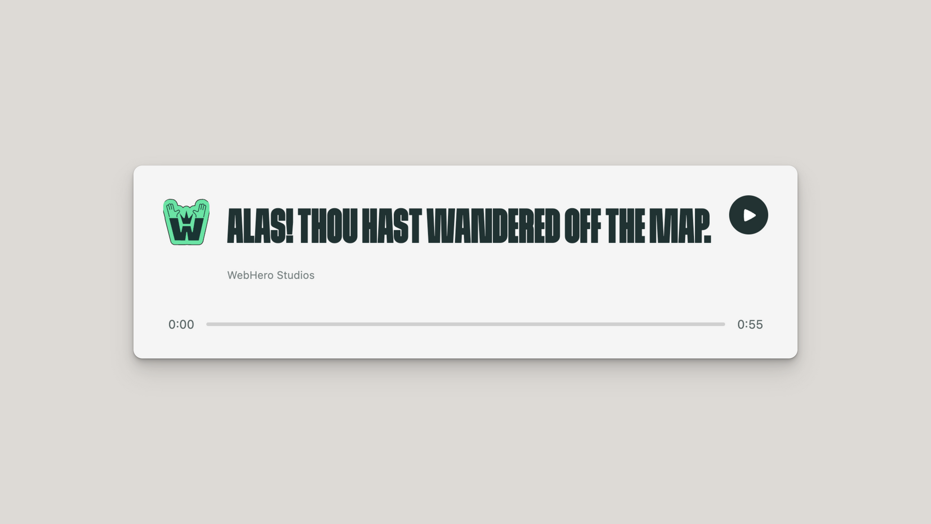
Alas! Thou hast wandered off the map.
WebHero Studios
Get Your Code
Copy and paste this code into your website to add the audio player:
- Copy the code above
- Paste it into your Duda HTML widget or website HTML where you want the audio player to appear
- The player will automatically load and be ready to use
Features of this audio player:
✓ Clean, modern design
✓ Smooth play/pause animations
✓ Clickable progress bar for seeking
✓ Time display with current and total duration
✓ Mobile responsive
✓ Powered by Howler.js for reliable audio playback
✓ Self-contained and safe for Duda websites
✓ No external dependencies beyond Howler.js

How to edit code using AI →
Resource Details:
Audio Player Widget creates a sleek, customizable audio playback interface powered by Howler.js for reliable cross-browser compatibility. When embedded on your page, it displays a modern player with album artwork, track information, play/pause controls, and an interactive progress timeline with time displays. Perfect for podcasts, music samples, audio testimonials, or background soundscapes with support for multiple style variants, custom color schemes, and responsive layouts. Self-contained implementation requires only a single code snippet, fully customizable through the visual generator with real-time preview.

NO-ACCESS
Only for Desktop Users
This page is only available on desktop.
Please Log in on a desktop to gain access.