Member
Account Settings
Share AgencyGenius
Know someone who might benefit from AgencyGenius? We'd love it if you shared our platform with your networking group!
Documentation
Step 1: Add HTML, Css & JavaScript
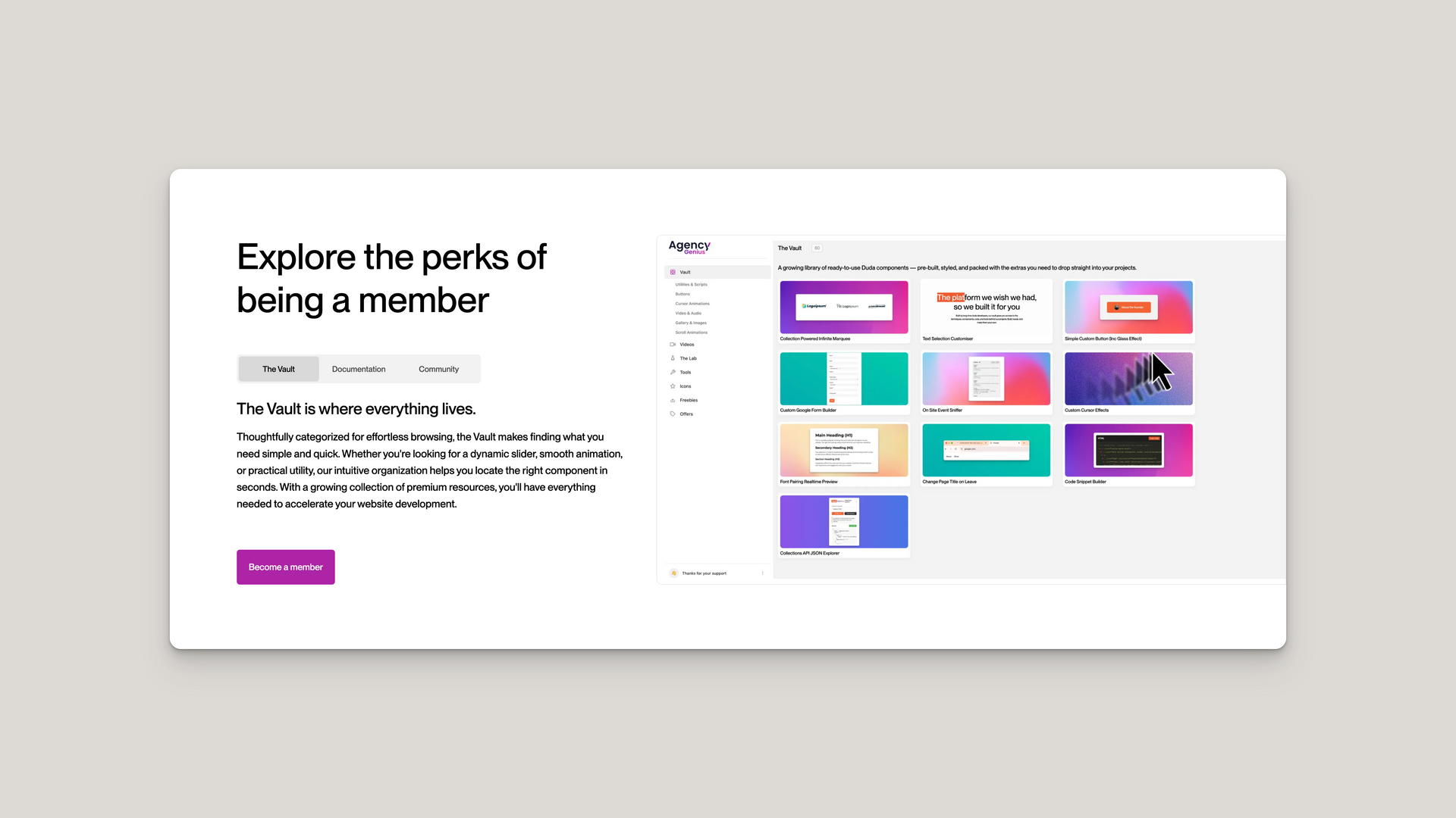
 <!-- Start: Improved Premium Content Tabs Widget with Mobile Optimization -->
 <div id="premium-tabs-widget">
 <div id="premium-tabs-container">
 <div class="tab-layout__wrap">
 <div class="tab-layout__col content-col">
 <div class="tab-content__wrap">
 <div class="tab-content__inner">
 <div class="tab-content__top">
 <h2 class="tab-heading">
 Explore the perks of being a member
 </h2>
 </div>
 <!-- Tab navigation buttons - horizontal for all devices -->
 <div class="tabs-buttons">
 <button class="tab-button active" data-tab-index="0">
 The Vault
 </button>
 <button class="tab-button" data-tab-index="1">
 Documentation
 </button>
 <button class="tab-button" data-tab-index="2">
 Community
 </button>
 <div class="tab-button-highlight">
 </div>
 </div>
 <!-- Tab content sections container -->
 <div class="tab-sections-container">
 <div class="tab-section active" data-tab-id="0">
 <h4 class="content-item__heading">
 The Vault is where everything lives.
 </h4>
 <p class="tab-description">
 Thoughtfully categorized for effortless browsing, the Vault makes finding what you need simple and quick. Whether you're looking for a dynamic slider, smooth animation, or practical utility, our intuitive organization helps you locate the right component in seconds. With a growing collection of premium resources, you'll have everything needed to accelerate your website development.
 </p>
 </div>
 <div class="tab-section" data-tab-id="1">
 <h4 class="content-item__heading">
 Detail pages you'll love, we promise
 </h4>
 <p class="tab-description">
 Each component comes with clear documentation — including clean code, helpful comments, and tutorial videos explaining the logic. We've structured instructions for all experience levels, from beginners to advanced developers. These code-based components offer flexibility but require embedding using HTML widgets, so you'll need to grab the code from the Vault to implement them.
 </p>
 </div>
 <div class="tab-section" data-tab-id="2">
 <h4 class="content-item__heading">
 Yes, we know it's a buzzword
 </h4>
 <p class="tab-description">
 'Community' might be overused these days, but we've created a space that truly delivers on the promise. Connect with fellow designers and developers to troubleshoot challenges, exchange ideas, or simply find others who understand your creative process. Our Slack-based community means you don't need another dedicated platform to remember—just join the conversation where you're already working and tap into collective wisdom whenever you need it.
 </p>
 </div>
 </div>
 <div class="button-container">
 <a href="#become-member" class="content-button">
 Become a member
 </a>
 </div>
 </div>
 </div>
 </div>
 <div class="tab-layout__col image-col">
 <div aria-live="polite" role="region" class="tab-visual__wrap">
 <div id="tab1" role="tabpanel" class="tab-visual__item active" data-tab-id="0">
 <div class="tab-visual__inner">
 <img src="https://irp.cdn-website.com/a778beb9/dms3rep/multi/Screenshot+2025-04-12+at+00.01.15.png" loading="lazy" alt="The Vault" class="tab-image">
 </div>
 </div>
 <div id="tab2" role="tabpanel" class="tab-visual__item" data-tab-id="1">
 <div class="tab-visual__inner">
 <img src="https://irp.cdn-website.com/a778beb9/dms3rep/multi/Screenshot+2025-04-11+at+05.15.40.png" loading="lazy" alt="Documentation" class="tab-image">
 </div>
 </div>
 <div id="tab3" role="tabpanel" class="tab-visual__item" data-tab-id="2">
 <div class="tab-visual__inner">
 <img src="https://irp.cdn-website.com/a778beb9/dms3rep/multi/Screenshot+2025-04-11+at+05.13.57.png" loading="lazy" alt="Community" class="tab-image">
 </div>
 </div>
 </div>
 </div>
 </div>
 </div>
 </div>
 <!-- End: Improved Premium Content Tabs Widget with Mobile Optimization -->
 /* Start: Improved Premium Content Tabs - CSS Styles */
 #premium-tabs-widget {
 /* Container wrapper to ensure proper isolation */
 font-family: inherit;
 box-sizing: border-box;
 }

 #premium-tabs-widget *,
 #premium-tabs-widget *:before,
 #premium-tabs-widget *:after {
 box-sizing: inherit;
 }

 #premium-tabs-container {
 background-color: #ffffff;
 padding: 6% 0 6% 6%;
 overflow: hidden;
 }

 #premium-tabs-container .tab-layout__wrap {
 z-index: 1;
 display: flex;
 flex-wrap: wrap;
 position: relative;
 }

 /* Columns sizing */
 #premium-tabs-container .content-col {
 width: 40%;
 padding-right: 3em;
 display: flex;
 flex-direction: column;
 }

 #premium-tabs-container .image-col {
 width: 60%;
 display: flex;
 justify-content: flex-start;
 }

 /* Content structure */
 #premium-tabs-container .tab-content__wrap {
 height: 100%;
 display: flex;
 flex-direction: column;
 }

 #premium-tabs-container .tab-content__inner {
 display: flex;
 flex-direction: column;
 height: 100%;
 }

 #premium-tabs-container .tab-content__top {
 margin-bottom: 1em;
 }

 /* Improved tab buttons with horizontal design for all screen sizes */
 #premium-tabs-container .tabs-buttons {
 display: inline-flex;
 background-color: rgba(0, 0, 0, 0.05);
 border-radius: 8px;
 padding: 4px;
 margin-bottom: 1.5em;
 margin-top: 0.5em;
 position: relative;
 width: fit-content; /* Only as wide as needed */
 flex-wrap: nowrap;
 align-self: flex-start;
 overflow-x: auto; /* Enable horizontal scrolling on mobile if needed */
 scrollbar-width: none; /* Hide scrollbar Firefox */
 -ms-overflow-style: none; /* Hide scrollbar IE/Edge */
 }

 /* Hide scrollbar for Chrome/Safari */
 #premium-tabs-container .tabs-buttons::-webkit-scrollbar {
 display: none;
 }

 #premium-tabs-container .tab-button {
 background: none;
 border: none;
 color: #000;
 padding: 12px 24px;
 font-size: 16px;
 cursor: pointer;
 transition: all 0.3s ease;
 opacity: 0.7;
 height: 50px;
 position: relative;
 z-index: 2;
 white-space: nowrap;
 overflow: hidden;
 text-overflow: ellipsis;
 flex: 1;
 min-width: 110px;
 }

 #premium-tabs-container .tab-button.active {
 opacity: 1;
 }

 #premium-tabs-container .tab-button-highlight {
 position: absolute;
 background-color: rgba(0, 0, 0, 0.1);
 border-radius: 6px;
 height: calc(100% - 8px);
 top: 4px;
 left: 4px;
 transition: transform 0.3s cubic-bezier(0.34, 1.56, 0.64, 1);
 z-index: 1;
 }

 /* Tab sections styling */
 #premium-tabs-container .tab-sections-container {
 flex: 1;
 position: relative;
 margin-bottom: 2em;
 min-height: 250px;
 width: 100%;
 }

 #premium-tabs-container .tab-section {
 opacity: 0;
 visibility: hidden;
 position: absolute;
 width: 100%;
 top: 0;
 left: 0;
 transition: opacity 0.3s ease, visibility 0.3s ease;
 }

 #premium-tabs-container .tab-section.active {
 opacity: 1;
 visibility: visible;
 position: relative;
 }

 #premium-tabs-container .tab-heading {
 margin-top: 0;
 margin-bottom: 0.5em;
 font-size: 42px;
 font-weight: 700;
 line-height: 1.2;
 color: #000;
 }

 #premium-tabs-container .content-item__heading {
 margin-top: 0;
 margin-bottom: 0.5em;
 font-size: 1.5em;
 font-weight: 600;
 line-height: 1.2;
 color: #333333;
 }

 #premium-tabs-container .tab-description {
 margin-bottom: 0;
 font-size: 1em;
 color: #000;
 line-height: 1.6;
 }

 /* Button styling */
 #premium-tabs-container .button-container {
 margin-top: auto;
 display: inline-block;
 width: auto;
 background: transparent;
 text-align: left;
 }

 #premium-tabs-container .content-button {
 display: inline-block;
 background-color: #ad24a6;
 color: #fff;
 padding: 0 24px;
 border-radius: 6px;
 text-decoration: none;
 font-weight: 500;
 transition: all 0.3s ease;
 height: 70px;
 line-height: 70px;
 font-size: 18px;
 text-align: center;
 }

 #premium-tabs-container .content-button:hover {
 background-color: #851c83;
 }

 /* Improved image styling for better mobile visibility */
 #premium-tabs-container .tab-visual__wrap {
 height: 100%;
 position: relative;
 min-height: 450px;
 display: flex;
 justify-content: flex-start;
 }

 #premium-tabs-container .tab-visual__item {
 display: none;
 height: 100%;
 position: absolute;
 top: 0;
 left: 0;
 width: auto; /* Only as wide as the image */
 max-width: 100%;
 }

 #premium-tabs-container .tab-visual__item.active {
 display: block;
 }

 #premium-tabs-container .tab-visual__inner {
 border: 1px solid rgba(0, 0, 0, 0.1);
 border-radius: 0.5em;
 height: 100%;
 padding: .5em;
 display: inline-block;
 overflow: hidden;
 }

 #premium-tabs-container .tab-image {
 object-fit: contain;
 object-position: left top;
 height: 100%;
 width: auto;
 max-width: 100%;
 border-radius: 0.25em;
 }

 /* Improved responsive media queries */
 @media screen and (max-width: 1200px) {
 #premium-tabs-container .content-col {
 width: 45%;
 }
 #premium-tabs-container .image-col {
 width: 55%;
 }
 }

 @media screen and (max-width: 1024px) {
 #premium-tabs-container .content-col,
 #premium-tabs-container .image-col {
 width: 100%;
 }
 #premium-tabs-container .content-col {
 padding-right: 6%;
 margin-bottom: 2em;
 }
 #premium-tabs-container .tab-content__wrap {
 height: auto;
 }
 #premium-tabs-container .tab-visual__wrap {
 height: 450px;
 }
 #premium-tabs-container .tab-visual__inner {
 border-radius: 0.5em;
 padding: 0.5em;
 }
 #premium-tabs-container .tab-image {
 border-radius: 0.25em;
 }
 #premium-tabs-container .tab-sections-container {
 min-height: 200px;
 }
 }

 @media screen and (max-width: 767px) {
 #premium-tabs-container {
 padding: 6%;
 }
 #premium-tabs-container .tab-heading {
 font-size: 36px;
 }
 #premium-tabs-container .content-col {
 padding-right: 0;
 }
 #premium-tabs-container .tab-sections-container {
 min-height: 220px;
 }
 #premium-tabs-container .button-container {
 margin-top: 1em;
 }
 #premium-tabs-container .tab-button {
 padding: 12px 16px;
 font-size: 15px;
 min-width: 100px;
 }
 #premium-tabs-container .tabs-buttons {
 min-width: auto; /* Allow natural width */
 width: fit-content; /* Only as wide as the content */
 justify-content: flex-start;
 }
 #premium-tabs-container .tab-visual__wrap {
 height: 400px;
 }
 }

 @media screen and (max-width: 480px) {
 #premium-tabs-container .tab-heading {
 font-size: 28px;
 }
 #premium-tabs-container .content-item__heading {
 font-size: 1.2em;
 }

 /* Key mobile improvements */
 #premium-tabs-container .tabs-buttons {
 /* Keep buttons horizontal but allow scrolling */
 flex-direction: row;
 overflow-x: auto;
 scroll-snap-type: x mandatory;
 padding: 4px;
 width: fit-content; /* Only as wide as the content */
 justify-content: flex-start;
 }

 #premium-tabs-container .tab-button {
 /* Keep buttons substantial enough to tap */
 height: 45px;
 padding: 10px 15px;
 font-size: 14px;
 scroll-snap-align: center;
 flex: 0 0 auto;
 min-width: 100px;
 text-align: center;
 }

 /* Keep the highlight on mobile */
 #premium-tabs-container .tab-button-highlight {
 display: block;
 }

 /* Full image display on mobile */
 #premium-tabs-container .tab-visual__wrap {
 height: auto; /* Auto height based on content */
 min-height: 300px; /* Minimum height to ensure visibility */
 margin-bottom: 2em; /* Add some bottom margin */
 width: fit-content; /* Only as wide as content */
 max-width: 100%; /* Don't overflow container */
 }

 #premium-tabs-container .tab-visual__inner {
 padding: 0.5em;
 border-radius: 0.5em; /* Round all corners */
 width: fit-content; /* Only as wide as the image */
 max-width: 100%; /* Don't overflow container */
 }

 #premium-tabs-container .tab-image {
 object-fit: contain; /* Show full image */
 border-radius: 0.25em; /* Round all corners */
 max-height: 100%; /* Ensure image is fully visible */
 width: auto; /* Natural width */
 max-width: 100%; /* Don't overflow container */
 }

 #premium-tabs-container .tab-visual__item {
 position: relative; /* Change from absolute positioning */
 height: auto; /* Auto height */
 width: fit-content; /* Only as wide as needed */
 max-width: 100%; /* Don't overflow container */
 }

 #premium-tabs-container .content-button {
 width: auto;
 height: 60px;
 line-height: 60px;
 }

 #premium-tabs-container .button-container {
 width: auto;
 display: inline-block;
 }

 #premium-tabs-container .tab-sections-container {
 min-height: 250px; /* Allow content to breathe */
 }
 }
 /* End: Improved Premium Content Tabs - CSS Styles */
 /* Start: Improved Premium Content Tabs - JavaScript */
 (function() {
 // Wait for DOM to be fully loaded
 document.addEventListener('DOMContentLoaded', function() {
 // Get main elements
 const widget = document.getElementById('premium-tabs-container');
 const tabButtons = widget.querySelectorAll('.tab-button');
 const tabSections = widget.querySelectorAll('.tab-section');
 const visualItems = widget.querySelectorAll('.tab-visual__item');
 const buttonHighlight = widget.querySelector('.tab-button-highlight');
 const images = widget.querySelectorAll('.tab-image');
 const tabsContainer = widget.querySelector('.tabs-buttons');

 // Track when images are loaded
 let imagesLoaded = 0;
 const totalImages = images.length;

 // Function to run when all images are loaded
 function handleImagesLoaded() {
 setInitialHighlight();
 updateHeights();
 // Initialize the first tab as active
 switchTab(0);
 }

 // Add load event listeners to all images
 images.forEach(img => {
 // If image is already loaded or has error
 if (img.complete) {
 imagesLoaded++;
 if (imagesLoaded === totalImages) {
 handleImagesLoaded();
 }
 } else {
 // Add load event listener
 img.addEventListener('load', function() {
 imagesLoaded++;
 if (imagesLoaded === totalImages) {
 handleImagesLoaded();
 }
 });
 // Handle errors too
 img.addEventListener('error', function() {
 imagesLoaded++;
 if (imagesLoaded === totalImages) {
 handleImagesLoaded();
 }
 });
 }
 });

 // Set initial button highlight position and width
 function setInitialHighlight() {
 const activeButton = widget.querySelector('.tab-button.active');
 if (activeButton && buttonHighlight) {
 buttonHighlight.style.width = `${activeButton.offsetWidth}px`;
 buttonHighlight.style.transform = `translateX(${activeButton.offsetLeft - 4}px)`;
 }
 }

 // Update button highlight on window resize
 function updateButtonHighlight() {
 const activeButton = widget.querySelector('.tab-button.active');
 if (activeButton && buttonHighlight) {
 buttonHighlight.style.width = `${activeButton.offsetWidth}px`;
 buttonHighlight.style.transform = `translateX(${activeButton.offsetLeft - 4}px)`;
 }
 }

 // Update heights for consistent display
 function updateHeights() {
 const contentCol = widget.querySelector('.content-col');
 const imageCol = widget.querySelector('.image-col');

 // Only set fixed height on larger screens
 if (window.innerWidth > 1024) {
 // Reset any previous inline heights
 tabSections.forEach(section => {
 section.style.minHeight = '';
 });

 // Find the tallest section content
 let maxHeight = 0;
 tabSections.forEach(section => {
 const clone = section.cloneNode(true);
 clone.classList.add('active');
 clone.style.position = 'absolute';
 clone.style.visibility = 'hidden';
 clone.style.display = 'block';
 widget.appendChild(clone);
 const height = clone.offsetHeight;
 widget.removeChild(clone);
 maxHeight = Math.max(maxHeight, height);
 });

 // Set minimum height for the tabs container
 const tabsContainer = widget.querySelector('.tab-sections-container');
 tabsContainer.style.minHeight = `${maxHeight}px`;

 // Make sure the image col matches the content col height
 const contentHeight = contentCol.offsetHeight;
 imageCol.style.height = `${contentHeight}px`;
 } else {
 // Handle mobile layout specifically
 if (window.innerWidth <= 480) {
 // For very small screens, ensure images are properly sized
 visualItems.forEach(item => {
 if (item.classList.contains('active')) {
 const img = item.querySelector('.tab-image');
 if (img) {
 // Get natural dimensions
 const imgRatio = img.naturalWidth / img.naturalHeight;

 // Set container to proper height based on content
 const idealHeight = Math.min(img.naturalHeight, 450);
 const idealWidth = Math.min(img.naturalWidth, item.parentNode.offsetWidth - 20); // Account for padding

 // Apply sizes to containers
 item.style.height = `${idealHeight}px`;
 item.style.width = `${idealWidth}px`;

 // Also set inner container width
 const innerContainer = item.querySelector('.tab-visual__inner');
 if (innerContainer) {
 innerContainer.style.width = `${idealWidth}px`;
 innerContainer.style.height = `${idealHeight}px`;
 }

 // Set minimum height for the visual wrap
 const visualWrap = widget.querySelector('.tab-visual__wrap');
 visualWrap.style.minHeight = `${idealHeight}px`;
 visualWrap.style.width = `${idealWidth}px`;
 }
 }
 });
 }

 // Reset heights on tablets
 imageCol.style.height = 'auto';

 // Ensure proper display of active section
 const activeSection = widget.querySelector('.tab-section.active');
 if (activeSection) {
 const tabsContainer = widget.querySelector('.tab-sections-container');
 tabsContainer.style.minHeight = `${activeSection.offsetHeight}px`;
 }
 }
 }

 // Function to switch tabs
 function switchTab(tabIndex) {
 // Remove active class from all tabs and sections
 tabButtons.forEach(btn => btn.classList.remove('active'));
 tabSections.forEach(section => section.classList.remove('active'));
 visualItems.forEach(item => item.classList.remove('active'));

 // Add active class to selected tab
 tabButtons[tabIndex].classList.add('active');

 // Find matching section and visual items by data-tab-id
 const selectedSection = widget.querySelector(`.tab-section[data-tab-id="${tabIndex}"]`);
 const selectedVisual = widget.querySelector(`.tab-visual__item[data-tab-id="${tabIndex}"]`);

 if (selectedSection) selectedSection.classList.add('active');
 if (selectedVisual) selectedVisual.classList.add('active');

 // Move the highlight for all screen sizes
 if (buttonHighlight) {
 const activeButton = tabButtons[tabIndex];
 buttonHighlight.style.width = `${activeButton.offsetWidth}px`;
 buttonHighlight.style.transform = `translateX(${activeButton.offsetLeft - 4}px)`;

 // Scroll to make active tab visible on mobile
 if (window.innerWidth <= 480) {
 const scrollLeft = activeButton.offsetLeft - (tabsContainer.offsetWidth / 2) + (activeButton.offsetWidth / 2);
 tabsContainer.scrollTo({
 left: scrollLeft,
 behavior: 'smooth'
 });
 }
 }

 // Update heights after tab change
 setTimeout(updateHeights, 50);
 }

 // Add hover effect to tab buttons
 tabButtons.forEach((button) => {
 button.addEventListener('mouseenter', function() {
 if (buttonHighlight) {
 buttonHighlight.style.width = `${this.offsetWidth}px`;
 buttonHighlight.style.transform = `translateX(${this.offsetLeft - 4}px)`;
 }
 });
 });

 // Return highlight to active button when leaving the button area
 tabsContainer.addEventListener('mouseleave', function() {
 const activeButton = widget.querySelector('.tab-button.active');
 if (activeButton && buttonHighlight) {
 buttonHighlight.style.width = `${activeButton.offsetWidth}px`;
 buttonHighlight.style.transform = `translateX(${activeButton.offsetLeft - 4}px)`;
 }
 });

 // Add click event listeners to tab buttons
 tabButtons.forEach((button, index) => {
 button.addEventListener('click', function() {
 switchTab(index);
 });
 });

 // Start auto-rotation only after initialization
 let autoRotate;
 function startAutoRotation() {
 let currentTabIndex = 0;
 autoRotate = setInterval(function() {
 currentTabIndex = (currentTabIndex + 1) % tabButtons.length;
 switchTab(currentTabIndex);
 }, 3000);
 }

 // Run initialization immediately if images are loaded already
 if (imagesLoaded === totalImages) {
 handleImagesLoaded();
 startAutoRotation();
 } else {
 // Set initial highlight and height as a fallback
 setInitialHighlight();
 updateHeights();
 switchTab(0);
 startAutoRotation();
 }

 // Pause rotation when interacting with tabs
 widget.addEventListener('mouseenter', function() {
 clearInterval(autoRotate);
 });

 // Resume rotation when leaving the widget
 widget.addEventListener('mouseleave', function() {
 clearInterval(autoRotate);
 startAutoRotation();
 });

 // Update on window resize
 let resizeTimer;
 window.addEventListener('resize', function() {
 clearTimeout(resizeTimer);
 resizeTimer = setTimeout(function() {
 updateHeights();
 updateButtonHighlight();
 }, 250);
 });
 });
 })();
 /* End: Improved Premium Content Tabs - JavaScript */
 <div id="snippet-sqqg5njv">
 <!-- HTML SECTION START -->
 <!-- Start: Improved Premium Content Tabs Widget with Mobile Optimization -->
 <div id="premium-tabs-widget">
 <div id="premium-tabs-container">
 <div class="tab-layout__wrap">
 <div class="tab-layout__col content-col">
 <div class="tab-content__wrap">
 <div class="tab-content__inner">
 <div class="tab-content__top">
 <h2 class="tab-heading">
 Explore the perks of being a member
 </h2>
 </div>
 <!-- Tab navigation buttons - horizontal for all devices -->
 <div class="tabs-buttons">
 <button class="tab-button active" data-tab-index="0">
 The Vault
 </button>
 <button class="tab-button" data-tab-index="1">
 Documentation
 </button>
 <button class="tab-button" data-tab-index="2">
 Community
 </button>
 <div class="tab-button-highlight">
 </div>
 </div>
 <!-- Tab content sections container -->
 <div class="tab-sections-container">
 <div class="tab-section active" data-tab-id="0">
 <h4 class="content-item__heading">
 The Vault is where everything lives.
 </h4>
 <p class="tab-description">
 Thoughtfully categorized for effortless browsing, the Vault makes finding what you need simple and quick. Whether you're looking for a dynamic slider, smooth animation, or practical utility, our intuitive organization helps you locate the right component in seconds. With a growing collection of premium resources, you'll have everything needed to accelerate your website development.
 </p>
 </div>
 <div class="tab-section" data-tab-id="1">
 <h4 class="content-item__heading">
 Detail pages you'll love, we promise
 </h4>
 <p class="tab-description">
 Each component comes with clear documentation — including clean code, helpful comments, and tutorial videos explaining the logic. We've structured instructions for all experience levels, from beginners to advanced developers. These code-based components offer flexibility but require embedding using HTML widgets, so you'll need to grab the code from the Vault to implement them.
 </p>
 </div>
 <div class="tab-section" data-tab-id="2">
 <h4 class="content-item__heading">
 Yes, we know it's a buzzword
 </h4>
 <p class="tab-description">
 'Community' might be overused these days, but we've created a space that truly delivers on the promise. Connect with fellow designers and developers to troubleshoot challenges, exchange ideas, or simply find others who understand your creative process. Our Slack-based community means you don't need another dedicated platform to remember—just join the conversation where you're already working and tap into collective wisdom whenever you need it.
 </p>
 </div>
 </div>
 <div class="button-container">
 <a href="#become-member" class="content-button">
 Become a member
 </a>
 </div>
 </div>
 </div>
 </div>
 <div class="tab-layout__col image-col">
 <div aria-live="polite" role="region" class="tab-visual__wrap">
 <div id="tab1" role="tabpanel" class="tab-visual__item active" data-tab-id="0">
 <div class="tab-visual__inner">
 <img src="https://irp.cdn-website.com/a778beb9/dms3rep/multi/Screenshot+2025-04-12+at+00.01.15.png" loading="lazy" alt="The Vault" class="tab-image">
 </div>
 </div>
 <div id="tab2" role="tabpanel" class="tab-visual__item" data-tab-id="1">
 <div class="tab-visual__inner">
 <img src="https://irp.cdn-website.com/a778beb9/dms3rep/multi/Screenshot+2025-04-11+at+05.15.40.png" loading="lazy" alt="Documentation" class="tab-image">
 </div>
 </div>
 <div id="tab3" role="tabpanel" class="tab-visual__item" data-tab-id="2">
 <div class="tab-visual__inner">
 <img src="https://irp.cdn-website.com/a778beb9/dms3rep/multi/Screenshot+2025-04-11+at+05.13.57.png" loading="lazy" alt="Community" class="tab-image">
 </div>
 </div>
 </div>
 </div>
 </div>
 </div>
 </div>
 <!-- End: Improved Premium Content Tabs Widget with Mobile Optimization -->
 <!-- HTML SECTION END -->

 <!-- CSS SECTION START -->
 <style>
 /* Start: Improved Premium Content Tabs - CSS Styles */
 #premium-tabs-widget {
 /* Container wrapper to ensure proper isolation */
 font-family: inherit;
 box-sizing: border-box;
 }

 #premium-tabs-widget *,
 #premium-tabs-widget *:before,
 #premium-tabs-widget *:after {
 box-sizing: inherit;
 }

 #premium-tabs-container {
 background-color: #ffffff;
 padding: 6% 0 6% 6%;
 overflow: hidden;
 }

 #premium-tabs-container .tab-layout__wrap {
 z-index: 1;
 display: flex;
 flex-wrap: wrap;
 position: relative;
 }

 /* Columns sizing */
 #premium-tabs-container .content-col {
 width: 40%;
 padding-right: 3em;
 display: flex;
 flex-direction: column;
 }

 #premium-tabs-container .image-col {
 width: 60%;
 display: flex;
 justify-content: flex-start;
 }

 /* Content structure */
 #premium-tabs-container .tab-content__wrap {
 height: 100%;
 display: flex;
 flex-direction: column;
 }

 #premium-tabs-container .tab-content__inner {
 display: flex;
 flex-direction: column;
 height: 100%;
 }

 #premium-tabs-container .tab-content__top {
 margin-bottom: 1em;
 }

 /* Improved tab buttons with horizontal design for all screen sizes */
 #premium-tabs-container .tabs-buttons {
 display: inline-flex;
 background-color: rgba(0, 0, 0, 0.05);
 border-radius: 8px;
 padding: 4px;
 margin-bottom: 1.5em;
 margin-top: 0.5em;
 position: relative;
 width: fit-content; /* Only as wide as needed */
 flex-wrap: nowrap;
 align-self: flex-start;
 overflow-x: auto; /* Enable horizontal scrolling on mobile if needed */
 scrollbar-width: none; /* Hide scrollbar Firefox */
 -ms-overflow-style: none; /* Hide scrollbar IE/Edge */
 }

 /* Hide scrollbar for Chrome/Safari */
 #premium-tabs-container .tabs-buttons::-webkit-scrollbar {
 display: none;
 }

 #premium-tabs-container .tab-button {
 background: none;
 border: none;
 color: #000;
 padding: 12px 24px;
 font-size: 16px;
 cursor: pointer;
 transition: all 0.3s ease;
 opacity: 0.7;
 height: 50px;
 position: relative;
 z-index: 2;
 white-space: nowrap;
 overflow: hidden;
 text-overflow: ellipsis;
 flex: 1;
 min-width: 110px;
 }

 #premium-tabs-container .tab-button.active {
 opacity: 1;
 }

 #premium-tabs-container .tab-button-highlight {
 position: absolute;
 background-color: rgba(0, 0, 0, 0.1);
 border-radius: 6px;
 height: calc(100% - 8px);
 top: 4px;
 left: 4px;
 transition: transform 0.3s cubic-bezier(0.34, 1.56, 0.64, 1);
 z-index: 1;
 }

 /* Tab sections styling */
 #premium-tabs-container .tab-sections-container {
 flex: 1;
 position: relative;
 margin-bottom: 2em;
 min-height: 250px;
 width: 100%;
 }

 #premium-tabs-container .tab-section {
 opacity: 0;
 visibility: hidden;
 position: absolute;
 width: 100%;
 top: 0;
 left: 0;
 transition: opacity 0.3s ease, visibility 0.3s ease;
 }

 #premium-tabs-container .tab-section.active {
 opacity: 1;
 visibility: visible;
 position: relative;
 }

 #premium-tabs-container .tab-heading {
 margin-top: 0;
 margin-bottom: 0.5em;
 font-size: 42px;
 font-weight: 700;
 line-height: 1.2;
 color: #000;
 }

 #premium-tabs-container .content-item__heading {
 margin-top: 0;
 margin-bottom: 0.5em;
 font-size: 1.5em;
 font-weight: 600;
 line-height: 1.2;
 color: #333333;
 }

 #premium-tabs-container .tab-description {
 margin-bottom: 0;
 font-size: 1em;
 color: #000;
 line-height: 1.6;
 }

 /* Button styling */
 #premium-tabs-container .button-container {
 margin-top: auto;
 display: inline-block;
 width: auto;
 background: transparent;
 text-align: left;
 }

 #premium-tabs-container .content-button {
 display: inline-block;
 background-color: #ad24a6;
 color: #fff;
 padding: 0 24px;
 border-radius: 6px;
 text-decoration: none;
 font-weight: 500;
 transition: all 0.3s ease;
 height: 70px;
 line-height: 70px;
 font-size: 18px;
 text-align: center;
 }

 #premium-tabs-container .content-button:hover {
 background-color: #851c83;
 }

 /* Improved image styling for better mobile visibility */
 #premium-tabs-container .tab-visual__wrap {
 height: 100%;
 position: relative;
 min-height: 450px;
 display: flex;
 justify-content: flex-start;
 }

 #premium-tabs-container .tab-visual__item {
 display: none;
 height: 100%;
 position: absolute;
 top: 0;
 left: 0;
 width: auto; /* Only as wide as the image */
 max-width: 100%;
 }

 #premium-tabs-container .tab-visual__item.active {
 display: block;
 }

 #premium-tabs-container .tab-visual__inner {
 border: 1px solid rgba(0, 0, 0, 0.1);
 border-radius: 0.5em;
 height: 100%;
 padding: .5em;
 display: inline-block;
 overflow: hidden;
 }

 #premium-tabs-container .tab-image {
 object-fit: contain;
 object-position: left top;
 height: 100%;
 width: auto;
 max-width: 100%;
 border-radius: 0.25em;
 }

 /* Improved responsive media queries */
 @media screen and (max-width: 1200px) {
 #premium-tabs-container .content-col {
 width: 45%;
 }
 #premium-tabs-container .image-col {
 width: 55%;
 }
 }

 @media screen and (max-width: 1024px) {
 #premium-tabs-container .content-col,
 #premium-tabs-container .image-col {
 width: 100%;
 }
 #premium-tabs-container .content-col {
 padding-right: 6%;
 margin-bottom: 2em;
 }
 #premium-tabs-container .tab-content__wrap {
 height: auto;
 }
 #premium-tabs-container .tab-visual__wrap {
 height: 450px;
 }
 #premium-tabs-container .tab-visual__inner {
 border-radius: 0.5em;
 padding: 0.5em;
 }
 #premium-tabs-container .tab-image {
 border-radius: 0.25em;
 }
 #premium-tabs-container .tab-sections-container {
 min-height: 200px;
 }
 }

 @media screen and (max-width: 767px) {
 #premium-tabs-container {
 padding: 6%;
 }
 #premium-tabs-container .tab-heading {
 font-size: 36px;
 }
 #premium-tabs-container .content-col {
 padding-right: 0;
 }
 #premium-tabs-container .tab-sections-container {
 min-height: 220px;
 }
 #premium-tabs-container .button-container {
 margin-top: 1em;
 }
 #premium-tabs-container .tab-button {
 padding: 12px 16px;
 font-size: 15px;
 min-width: 100px;
 }
 #premium-tabs-container .tabs-buttons {
 min-width: auto; /* Allow natural width */
 width: fit-content; /* Only as wide as the content */
 justify-content: flex-start;
 }
 #premium-tabs-container .tab-visual__wrap {
 height: 400px;
 }
 }

 @media screen and (max-width: 480px) {
 #premium-tabs-container .tab-heading {
 font-size: 28px;
 }
 #premium-tabs-container .content-item__heading {
 font-size: 1.2em;
 }

 /* Key mobile improvements */
 #premium-tabs-container .tabs-buttons {
 /* Keep buttons horizontal but allow scrolling */
 flex-direction: row;
 overflow-x: auto;
 scroll-snap-type: x mandatory;
 padding: 4px;
 width: fit-content; /* Only as wide as the content */
 justify-content: flex-start;
 }

 #premium-tabs-container .tab-button {
 /* Keep buttons substantial enough to tap */
 height: 45px;
 padding: 10px 15px;
 font-size: 14px;
 scroll-snap-align: center;
 flex: 0 0 auto;
 min-width: 100px;
 text-align: center;
 }

 /* Keep the highlight on mobile */
 #premium-tabs-container .tab-button-highlight {
 display: block;
 }

 /* Full image display on mobile */
 #premium-tabs-container .tab-visual__wrap {
 height: auto; /* Auto height based on content */
 min-height: 300px; /* Minimum height to ensure visibility */
 margin-bottom: 2em; /* Add some bottom margin */
 width: fit-content; /* Only as wide as content */
 max-width: 100%; /* Don't overflow container */
 }

 #premium-tabs-container .tab-visual__inner {
 padding: 0.5em;
 border-radius: 0.5em; /* Round all corners */
 width: fit-content; /* Only as wide as the image */
 max-width: 100%; /* Don't overflow container */
 }

 #premium-tabs-container .tab-image {
 object-fit: contain; /* Show full image */
 border-radius: 0.25em; /* Round all corners */
 max-height: 100%; /* Ensure image is fully visible */
 width: auto; /* Natural width */
 max-width: 100%; /* Don't overflow container */
 }

 #premium-tabs-container .tab-visual__item {
 position: relative; /* Change from absolute positioning */
 height: auto; /* Auto height */
 width: fit-content; /* Only as wide as needed */
 max-width: 100%; /* Don't overflow container */
 }

 #premium-tabs-container .content-button {
 width: auto;
 height: 60px;
 line-height: 60px;
 }

 #premium-tabs-container .button-container {
 width: auto;
 display: inline-block;
 }

 #premium-tabs-container .tab-sections-container {
 min-height: 250px; /* Allow content to breathe */
 }
 }
 /* End: Improved Premium Content Tabs - CSS Styles */
 </style>
 <!-- CSS SECTION END -->

 <!-- JAVASCRIPT SECTION START -->
 <script>
 /* Start: Improved Premium Content Tabs - JavaScript */
 (function() {
 // Wait for DOM to be fully loaded
 document.addEventListener('DOMContentLoaded', function() {
 // Get main elements
 const widget = document.getElementById('premium-tabs-container');
 const tabButtons = widget.querySelectorAll('.tab-button');
 const tabSections = widget.querySelectorAll('.tab-section');
 const visualItems = widget.querySelectorAll('.tab-visual__item');
 const buttonHighlight = widget.querySelector('.tab-button-highlight');
 const images = widget.querySelectorAll('.tab-image');
 const tabsContainer = widget.querySelector('.tabs-buttons');

 // Track when images are loaded
 let imagesLoaded = 0;
 const totalImages = images.length;

 // Function to run when all images are loaded
 function handleImagesLoaded() {
 setInitialHighlight();
 updateHeights();
 // Initialize the first tab as active
 switchTab(0);
 }

 // Add load event listeners to all images
 images.forEach(img => {
 // If image is already loaded or has error
 if (img.complete) {
 imagesLoaded++;
 if (imagesLoaded === totalImages) {
 handleImagesLoaded();
 }
 } else {
 // Add load event listener
 img.addEventListener('load', function() {
 imagesLoaded++;
 if (imagesLoaded === totalImages) {
 handleImagesLoaded();
 }
 });
 // Handle errors too
 img.addEventListener('error', function() {
 imagesLoaded++;
 if (imagesLoaded === totalImages) {
 handleImagesLoaded();
 }
 });
 }
 });

 // Set initial button highlight position and width
 function setInitialHighlight() {
 const activeButton = widget.querySelector('.tab-button.active');
 if (activeButton && buttonHighlight) {
 buttonHighlight.style.width = `${activeButton.offsetWidth}px`;
 buttonHighlight.style.transform = `translateX(${activeButton.offsetLeft - 4}px)`;
 }
 }

 // Update button highlight on window resize
 function updateButtonHighlight() {
 const activeButton = widget.querySelector('.tab-button.active');
 if (activeButton && buttonHighlight) {
 buttonHighlight.style.width = `${activeButton.offsetWidth}px`;
 buttonHighlight.style.transform = `translateX(${activeButton.offsetLeft - 4}px)`;
 }
 }

 // Update heights for consistent display
 function updateHeights() {
 const contentCol = widget.querySelector('.content-col');
 const imageCol = widget.querySelector('.image-col');

 // Only set fixed height on larger screens
 if (window.innerWidth > 1024) {
 // Reset any previous inline heights
 tabSections.forEach(section => {
 section.style.minHeight = '';
 });

 // Find the tallest section content
 let maxHeight = 0;
 tabSections.forEach(section => {
 const clone = section.cloneNode(true);
 clone.classList.add('active');
 clone.style.position = 'absolute';
 clone.style.visibility = 'hidden';
 clone.style.display = 'block';
 widget.appendChild(clone);
 const height = clone.offsetHeight;
 widget.removeChild(clone);
 maxHeight = Math.max(maxHeight, height);
 });

 // Set minimum height for the tabs container
 const tabsContainer = widget.querySelector('.tab-sections-container');
 tabsContainer.style.minHeight = `${maxHeight}px`;

 // Make sure the image col matches the content col height
 const contentHeight = contentCol.offsetHeight;
 imageCol.style.height = `${contentHeight}px`;
 } else {
 // Handle mobile layout specifically
 if (window.innerWidth <= 480) {
 // For very small screens, ensure images are properly sized
 visualItems.forEach(item => {
 if (item.classList.contains('active')) {
 const img = item.querySelector('.tab-image');
 if (img) {
 // Get natural dimensions
 const imgRatio = img.naturalWidth / img.naturalHeight;

 // Set container to proper height based on content
 const idealHeight = Math.min(img.naturalHeight, 450);
 const idealWidth = Math.min(img.naturalWidth, item.parentNode.offsetWidth - 20); // Account for padding

 // Apply sizes to containers
 item.style.height = `${idealHeight}px`;
 item.style.width = `${idealWidth}px`;

 // Also set inner container width
 const innerContainer = item.querySelector('.tab-visual__inner');
 if (innerContainer) {
 innerContainer.style.width = `${idealWidth}px`;
 innerContainer.style.height = `${idealHeight}px`;
 }

 // Set minimum height for the visual wrap
 const visualWrap = widget.querySelector('.tab-visual__wrap');
 visualWrap.style.minHeight = `${idealHeight}px`;
 visualWrap.style.width = `${idealWidth}px`;
 }
 }
 });
 }

 // Reset heights on tablets
 imageCol.style.height = 'auto';

 // Ensure proper display of active section
 const activeSection = widget.querySelector('.tab-section.active');
 if (activeSection) {
 const tabsContainer = widget.querySelector('.tab-sections-container');
 tabsContainer.style.minHeight = `${activeSection.offsetHeight}px`;
 }
 }
 }

 // Function to switch tabs
 function switchTab(tabIndex) {
 // Remove active class from all tabs and sections
 tabButtons.forEach(btn => btn.classList.remove('active'));
 tabSections.forEach(section => section.classList.remove('active'));
 visualItems.forEach(item => item.classList.remove('active'));

 // Add active class to selected tab
 tabButtons[tabIndex].classList.add('active');

 // Find matching section and visual items by data-tab-id
 const selectedSection = widget.querySelector(`.tab-section[data-tab-id="${tabIndex}"]`);
 const selectedVisual = widget.querySelector(`.tab-visual__item[data-tab-id="${tabIndex}"]`);

 if (selectedSection) selectedSection.classList.add('active');
 if (selectedVisual) selectedVisual.classList.add('active');

 // Move the highlight for all screen sizes
 if (buttonHighlight) {
 const activeButton = tabButtons[tabIndex];
 buttonHighlight.style.width = `${activeButton.offsetWidth}px`;
 buttonHighlight.style.transform = `translateX(${activeButton.offsetLeft - 4}px)`;

 // Scroll to make active tab visible on mobile
 if (window.innerWidth <= 480) {
 const scrollLeft = activeButton.offsetLeft - (tabsContainer.offsetWidth / 2) + (activeButton.offsetWidth / 2);
 tabsContainer.scrollTo({
 left: scrollLeft,
 behavior: 'smooth'
 });
 }
 }

 // Update heights after tab change
 setTimeout(updateHeights, 50);
 }

 // Add hover effect to tab buttons
 tabButtons.forEach((button) => {
 button.addEventListener('mouseenter', function() {
 if (buttonHighlight) {
 buttonHighlight.style.width = `${this.offsetWidth}px`;
 buttonHighlight.style.transform = `translateX(${this.offsetLeft - 4}px)`;
 }
 });
 });

 // Return highlight to active button when leaving the button area
 tabsContainer.addEventListener('mouseleave', function() {
 const activeButton = widget.querySelector('.tab-button.active');
 if (activeButton && buttonHighlight) {
 buttonHighlight.style.width = `${activeButton.offsetWidth}px`;
 buttonHighlight.style.transform = `translateX(${activeButton.offsetLeft - 4}px)`;
 }
 });

 // Add click event listeners to tab buttons
 tabButtons.forEach((button, index) => {
 button.addEventListener('click', function() {
 switchTab(index);
 });
 });

 // Start auto-rotation only after initialization
 let autoRotate;
 function startAutoRotation() {
 let currentTabIndex = 0;
 autoRotate = setInterval(function() {
 currentTabIndex = (currentTabIndex + 1) % tabButtons.length;
 switchTab(currentTabIndex);
 }, 3000);
 }

 // Run initialization immediately if images are loaded already
 if (imagesLoaded === totalImages) {
 handleImagesLoaded();
 startAutoRotation();
 } else {
 // Set initial highlight and height as a fallback
 setInitialHighlight();
 updateHeights();
 switchTab(0);
 startAutoRotation();
 }

 // Pause rotation when interacting with tabs
 widget.addEventListener('mouseenter', function() {
 clearInterval(autoRotate);
 });

 // Resume rotation when leaving the widget
 widget.addEventListener('mouseleave', function() {
 clearInterval(autoRotate);
 startAutoRotation();
 });

 // Update on window resize
 let resizeTimer;
 window.addEventListener('resize', function() {
 clearTimeout(resizeTimer);
 resizeTimer = setTimeout(function() {
 updateHeights();
 updateButtonHighlight();
 }, 250);
 });
 });
 })();
 /* End: Improved Premium Content Tabs - JavaScript */
 </script>
 <!-- JAVASCRIPT SECTION END -->
 </div>
Premium Tabs Widget
The Premium Tabs Widget creates an elegant tabbed interface with smooth transitions and autoplay functionality. It features a responsive design that adapts to different screen sizes while maintaining full visibility of images on mobile devices.
HTML Structure
The HTML structure consists of two main columns:
- The main container #premium-tabs-container holds all content
- A content column .content-col contains text content and tab navigation
- An image column .image-col displays visual content for each tab
- Navigation is handled by .tabs-buttons containing individual .tab-button elements
- Each tab's content is stored in .tab-section divs with matching data-tab-id attributes
- Images are contained in .tab-visual__item elements that correspond to each tab
CSS Styling
The styling creates a clean, professional appearance:
- Uses flexbox for responsive layout between content and image columns
- Creates a dynamic tab interface with .tab-button-highlight animation
- Tab buttons use width: fit-content to ensure background only fits needed space
- Images are configured with object-fit: contain for mobile to ensure full visibility
- Content fades in and out with opacity transitions
- Note: Adjust the padding values (currently 6% 0 6% 6% ) to match your site's spacing requirements
- Container uses font-family: inherit to adopt your site's typography
JavaScript Functionality
The JavaScript handles interactions and animations:
- Tab switching via switchTab() function that manages active states
- Autoplay functionality with configurable intervals (default: 3000ms )
- Pause on hover to let users examine content without interruption
- Dynamic sizing of images based on their natural dimensions
- Button highlight effect that slides to indicate the active tab
- Responsive adjustments with updateHeights() function
- Image preloading to prevent layout shifts with handleImagesLoaded()
Mobile Optimizations
Special considerations for mobile devices:
- Tab buttons remain horizontal with a scrollable container on small screens
- Images properly scale to show complete content without cropping
- Image containers use width: fit-content to prevent unnecessary borders
- Active tab is automatically scrolled into view on mobile
- Responsive breakpoints at 1200px , 1024px , 767px , and 480px
- Stack layout automatically adjusts when screen size becomes too narrow
Customization Options
You can customize various aspects of the widget:
- Tab content: Modify the text and images in .tab-section and .tab-visual__item elements
- Colors: Change the background-color of buttons and border colors
- Timing: Adjust the setInterval delay in the startAutoRotation() function
- Layout proportions: Modify the width percentages of the columns
- Call-to-action: Update the .content-button text and link
- Spacing: Adjust padding and margin values to match your site's design system
- Animation speed: Modify transition durations in CSS
Integration Tips
For seamless integration with your site:
- Ensure the parent container has appropriate width constraints
- Match padding values with your site's spacing system
- Update the content button color ( #ad24a6 ) to match your brand
- Adjust media query breakpoints if they don't align with your site's responsive behavior
- Ensure image paths are properly set up in your environment
- Consider preloading images for improved performance
- If implementing multiple tab components on one page, use unique IDs for each

How to edit code using AI →
Resource Details:
Content Tabs with Autoplay creates an interactive tabbed interface for your website. Tabs switch when clicked, displaying content and images with smooth transitions. Features autoplay rotation, hover effects on tab buttons, and a sliding highlight indicator. Includes responsive design that adapts to all screen sizes. Simple HTML/CSS/JS implementation with customizable content, timing, and styling options.

NO-ACCESS
Only for Desktop Users
This page is only available on desktop.
Please Log in on a desktop to gain access.