Member
Account Settings
Share AgencyGenius
Know someone who might benefit from AgencyGenius? We'd love it if you shared our platform with your networking group!
Documentation
Tool
We've listed the documentation below.
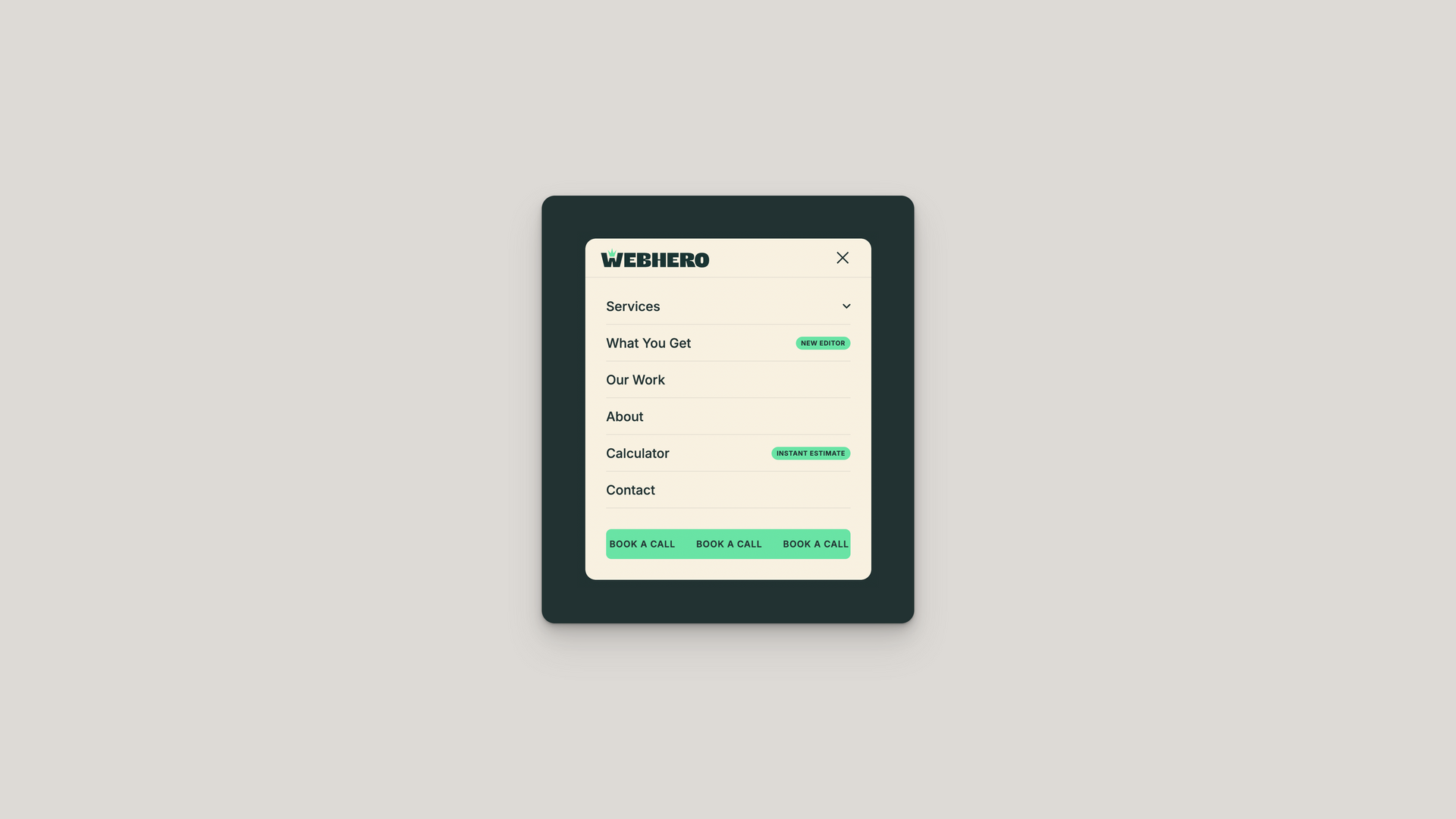
Mobile Navigation Menu Overview
The Mobile Navigation Menu creates a responsive, touch-optimized navigation system that transforms traditional desktop menus into elegant mobile experiences. It features customizable animations, smart positioning, dropdown support, and optional call-to-action buttons, all while maintaining zero dependencies and working seamlessly across all modern mobile browsers.
HTML Structure
The generated HTML structure consists of:
- A unique wrapper ID like mobile-nav-abc123 for complete isolation
- Navigation wrapper with data-nav-status="not-active" for state management
- Semantic nav element with role="navigation" and aria-label="Mobile navigation"
- Overlay div with data-nav-toggle="close" for backdrop clicks
- Fixed header with logo and hamburger button using position: relative; z-index: 10001
- Self-contained JavaScript wrapped in an IIFE with event delegation
Hamburger Animation System
The hamburger button transforms with three distinct animation styles:
- Elastic style uses cubic-bezier(.65, 0, 0, 1) for smooth transitions
- Transform origin centered with position: absolute; left: 50%; margin-left: -12px
- Active state rotations: rotate(45deg) and rotate(-45deg)
- Minimal style with 1px lines transitioning from translateY(-3px) to center
- Three dots animation with transform: scale(0) on outer dots
- Button container fixed at width: 40px; height: 40px for consistent hit area
Menu Positioning
Four position options with corresponding transforms:
- Left slide: left: 0; transform: translateX(-100%)
- Right slide: right: 0; transform: translateX(100%)
- Top slide: top: 0; transform: translateY(-100%)
- Bottom sheet: bottom: 0; transform: translateY(100%)
- Width constraints: width: 85%; max-width: 320px for side menus
- Active state: transform: translate(0, 0) with smooth transitions
Navigation Items
Menu items support multiple configurations:
- Button element for dropdowns with data-dropdown-toggle attribute
- Flexbox layout: display: flex; justify-content: space-between
- Badge support with font-size: 0.625rem; padding: 0.25rem 0.5rem
- Hover states: background-color: rgba(r, g, b, 0.05)
- Bottom border separator: ::after pseudo-element
- Active page detection with aria-current="page"
Dropdown Implementation
Expandable sub-menus with smooth animations:
- Container with max-height: 0; overflow: hidden when collapsed
- Expanded state: data-expanded="true" and max-height: 500px
- Arrow rotation: transform: rotate(180deg) when open
- ARIA controls: aria-expanded and aria-controls
- Nested items with padding-left: 3rem for hierarchy
- Border accent on hover: border-left: 3px solid
CTA Button Features
Optional call-to-action with animation options:
- Wrapper padding: padding: 0 2rem for alignment
- Marquee animation using @keyframes marquee with infinite loop
- Duplicate content for seamless scrolling: data-marquee-list
- Pulse effect: transform: scale(1.05) at 50% keyframe
- Hover state: animation-play-state: paused for marquee
- Text wrapping prevented: white-space: nowrap
Overlay Behavior
Background overlay provides focus and click-to-close:
- Fixed positioning: position: fixed; inset: 0
- Initial state: opacity: 0; visibility: hidden
- Active transition: opacity: 0.3; visibility: visible
- Cubic bezier easing: cubic-bezier(0.5, 0.5, 0, 1)
- Pointer events management prevents interaction when hidden
- Z-index: 999 below menu content
Event Handling System
Comprehensive event management for interactions:
- Toggle buttons selected by [data-nav-toggle] attribute
- Click prevention: e.stopPropagation() on menu items
- ESC key support: keyCode === 27 for legacy browsers
- Body scroll lock: body.nav-open { overflow: hidden }
- ARIA updates: setAttribute('aria-expanded', 'true')
- Dropdown state reset on menu close for clean UX
CSS Architecture
Scoped styling prevents conflicts:
- All selectors prefixed: #mobile-nav-abc123 .nav-link
- Box model reset: * { box-sizing: border-box }
- Font inheritance: font-family: inherit for site consistency
- Z-index hierarchy: 10001 header, 10000 menu
- Focus states: outline: 2px solid; outline-offset: 2px
- CSS transitions on all interactive elements
Responsive Breakpoints
Adaptive behavior across devices:
- Mobile-first approach with @media (max-width: 400px)
- Full width on small screens: width: 100%; max-width: none
- Touch-friendly tap targets minimum 44px height
- Padding adjustments maintain usability on all sizes
- Text sizing with font-size: 1.125rem for readability
- No horizontal scroll with proper overflow management
Animation Performance
GPU-accelerated animations ensure smooth performance:
- Transform-only animations: translateX() and rotate()
- Will-change not used to avoid memory issues
- Transition timing: 0.5s cubic-bezier(0.4, 0, 0.2, 1)
- Staggered animations prevent jank
- Hardware acceleration implicit with transforms
- Reflow minimized with fixed positioning
Accessibility Features
Built-in accessibility ensures inclusive design:
- Semantic HTML with proper heading structure
- ARIA labels: aria-label="Toggle menu"
- Focus management maintains keyboard navigation
- Color contrast ratios meet WCAG AA standards
- Screen reader announcements for state changes
- Skip links compatible with :focus-visible
URL Path Detection
Automatic active page highlighting:
- Current path: window.location.pathname
- Exact match check: currentPath === linkPath
- Subfolder support: currentPath.startsWith(linkPath)
- Homepage exception prevents false matches
- Visual indicator via background color change
- ARIA current attribute for screen readers
Performance Optimization
Lightweight implementation prioritizes speed:
- Zero external dependencies - vanilla JavaScript only
- Single paint with batched DOM updates
- Event delegation reduces memory footprint
- CSS containment with fixed positioning
- No layout thrashing with transform-only animations
- Passive event listeners where applicable
- Total size under 15KB uncompressed
Implementation Benefits
This solution provides significant advantages:
- Works immediately without initialization or configuration
- Compatible with all page builders including Duda, WordPress, Wix
- No jQuery, React, or framework dependencies
- Immune to JavaScript conflicts with scoped IIFE
- SEO-friendly with proper semantic markup
- Works with strict Content Security Policies
- Can be dynamically injected via tag managers
- Maintains functionality with JavaScript disabled (basic menu visible)
- Future-proof with standard APIs only
- RTL language support with logical properties ready
Basic Settings
Navigation Items
Call-to-Action Button
Colors & Styling
Live Preview
Generated Code
• Accessible with ARIA attributes
• Mobile-optimized touch interactions
• Dropdown support for sub-menus
• Customizable badges and CTAs
• No external dependencies

How to edit code using AI →
Resource Details:
Mobile Navigation Menu revolutionizes how visitors interact with your website on smartphones and tablets by replacing clunky desktop menus with an elegant, thumb-friendly navigation system. This intelligent solution automatically adapts to any screen position – sliding in from the side, dropping down from the top, or emerging from the bottom – while maintaining your brand identity through customizable colors and smooth animations. The hamburger menu transforms with elastic, minimal, or dot animations that provide satisfying visual feedback, while dropdown support handles complex site structures without overwhelming mobile users. Pre-built with accessibility in mind, it includes touch-optimized tap targets, keyboard navigation support, and ARIA attributes for screen readers. The lightweight, framework-free implementation loads instantly without jQuery or React dependencies, featuring optional call-to-action buttons with eye-catching marquee or pulse animations that drive conversions even on the smallest screens.

NO-ACCESS
Only for Desktop Users
This page is only available on desktop.
Please Log in on a desktop to gain access.