Member
Account Settings
Share AgencyGenius
Know someone who might benefit from AgencyGenius? We'd love it if you shared our platform with your networking group!
Documentation
Tool
We've listed the code documentation below.
Draggable Image Widget Overview
The Draggable Image Widget creates a floating, interactive image element that users can drag around the screen. It supports both mouse and touch interactions, customizable animations, hover effects, and optional viewport constraints. The widget is completely self-contained with no external dependencies.
HTML Structure
The generated widget consists of:
- A unique container ID like draggable-widget-abc123 for namespace isolation
- Fixed positioning container with pointer-events: none covering the viewport
- A .draggable-widget div with pointer-events: all for interaction
- An img element with drag prevention styles
- Scoped CSS using the container ID to prevent conflicts
- Self-executing JavaScript wrapped in an IIFE for encapsulation
JavaScript State Management
The drag functionality maintains several state variables:
- isDragging : Boolean flag tracking active drag state
- currentX and currentY : Current translation values
- initialX and initialY : Starting cursor/touch positions
- xOffset and yOffset : Accumulated translation offsets (initialized to 0)
- Variables are scoped within the IIFE to avoid global pollution
Event Handling System
The widget implements unified handling for mouse and touch events:
- Touch events use { passive: false } to enable preventDefault
- dragStart function handles both mousedown and touchstart
- Event type detection: e.type === "touchstart" for touch handling
- Touch coordinates extracted via e.touches[0].clientX/Y
- Target validation ensures drag starts on widget: e.target === widget || e.target.parentElement === widget
- Document-level mouseup listener prevents stuck drag state
Drag Calculation Logic
Position updates during dragging follow this process:
- Delta calculation: currentX = e.clientX - initialX
- Offset tracking maintains position between drags
- Initial offsets always start at xOffset = 0 and yOffset = 0
- The setTranslate function applies CSS transforms
- Transform string construction includes rotation and scale values
- dragEnd updates initial positions: initialX = currentX
Viewport Constraint Implementation
When constraints are enabled, boundary detection prevents overflow:
- Widget bounds calculated with getBoundingClientRect()
- Maximum positions: maxX = window.innerWidth - rect.width
- Left boundary check: if (rect.left + currentX < 0)
- Position clamping: currentX = -rect.left for left edge
- Similar calculations applied for top, right, and bottom edges
- Offsets updated after clamping to maintain consistency
CSS Positioning Strategy
The widget uses a sophisticated positioning approach:
- Container uses position: fixed with full viewport coverage
- High z-index values up to 2147483647 (max 32-bit integer)
- Initial positions support five presets using different techniques:
- Center: Uses calc(50% - ${width/2}px) for both left and top
- Corners: Use combinations of left , right , top , bottom
- Edge positions maintain 20px padding from viewport edges
- Transform property reserved exclusively for drag offsets and visual effects
Transform Management
CSS transforms handle all visual positioning and effects:
- Base transform only includes drag offset and rotation: translate(Xpx, Ypx) rotate(Xdeg)
- Initial positioning handled by position properties, not transforms
- Hover state adds scale: scale(1.05)
- Transition property: transition: transform 0.2s ease
- .dragging class sets transition: none for smooth dragging
- Transform order matters: translate → rotate → scale
- transform-origin: center ensures proper rotation/scale behavior
Hover Effects System
Optional hover animations enhance interactivity:
- JavaScript event listeners handle hover to preserve drag position
- mouseenter applies transform with current offset: translate(xOffset, yOffset) rotate(hoverRotation) scale(hoverScale)
- mouseleave restores original rotation while maintaining position
- Hover effects only apply when !isDragging to prevent conflicts
- Transform values are dynamically calculated to prevent position jumping
- Smooth transitions create professional animation feel
Image Handling Details
Special considerations for the draggable image element:
- user-select: none prevents text selection
- -webkit-user-drag: none disables native drag behavior
- width: 100% with height: auto maintains aspect ratio
- display: block removes inline spacing issues
- Parent div controls actual size via width property
Cursor State Management
Visual feedback through cursor changes:
- Default cursor options: grab , pointer , move , default
- Active drag state changes grab to grabbing
- Cursor property applied to .draggable-widget class
- Dynamic cursor switching via .dragging class
Performance Optimizations
The widget implements several performance best practices:
- Event listeners use preventDefault() to stop default behaviors
- Transform-based positioning avoids layout reflows
- Separating initial positioning from transforms prevents calculation conflicts
- Transitions disabled during active dragging
- Single transform property update instead of multiple style changes
- No requestAnimationFrame needed due to event-driven updates
- Minimal DOM manipulation after initialization
Browser Compatibility Features
Cross-browser support through careful implementation:
- Vendor prefix -webkit-user-drag for Safari
- Touch event support for mobile devices
- Fallback cursor styles for older browsers
- Standard DOM APIs ensure wide compatibility
- No modern JavaScript features requiring transpilation
- CSS transforms supported in all modern browsers
Common Implementation Pitfalls
Key considerations to avoid common issues:
- Never use CSS :hover for transform changes - it overwrites drag position
- Avoid mixing percentage-based transforms with pixel offsets
- Always initialize offset variables to match initial positioning method
- Use calc() for centering instead of transform translate
- Ensure transform-origin is set when using rotation or scale
- Handle both mouse and touch events for cross-device compatibility
Implementation Advantages
This self-contained approach offers multiple benefits:
- Zero dependencies - no jQuery, interact.js, or other libraries
- Lightweight footprint under 3KB uncompressed
- No initialization required - runs immediately on page load
- Multiple instances supported via unique IDs
- No global namespace pollution
- Works in iframes and shadow DOM environments
- Compatible with React, Vue, and other frameworks
- No build process or module bundler needed
Image Settings
Enter the URL of the image you want to make draggable
Important for accessibility and SEO
Position & Layout
Higher values appear above other elements
Keep image within screen boundaries
Animation & Effects
Live Preview

Generated Code
- Smooth drag and drop functionality
- Touch-enabled for mobile devices
- Customizable animations and effects
- No external dependencies required

How to edit code using AI →
Resource Details:
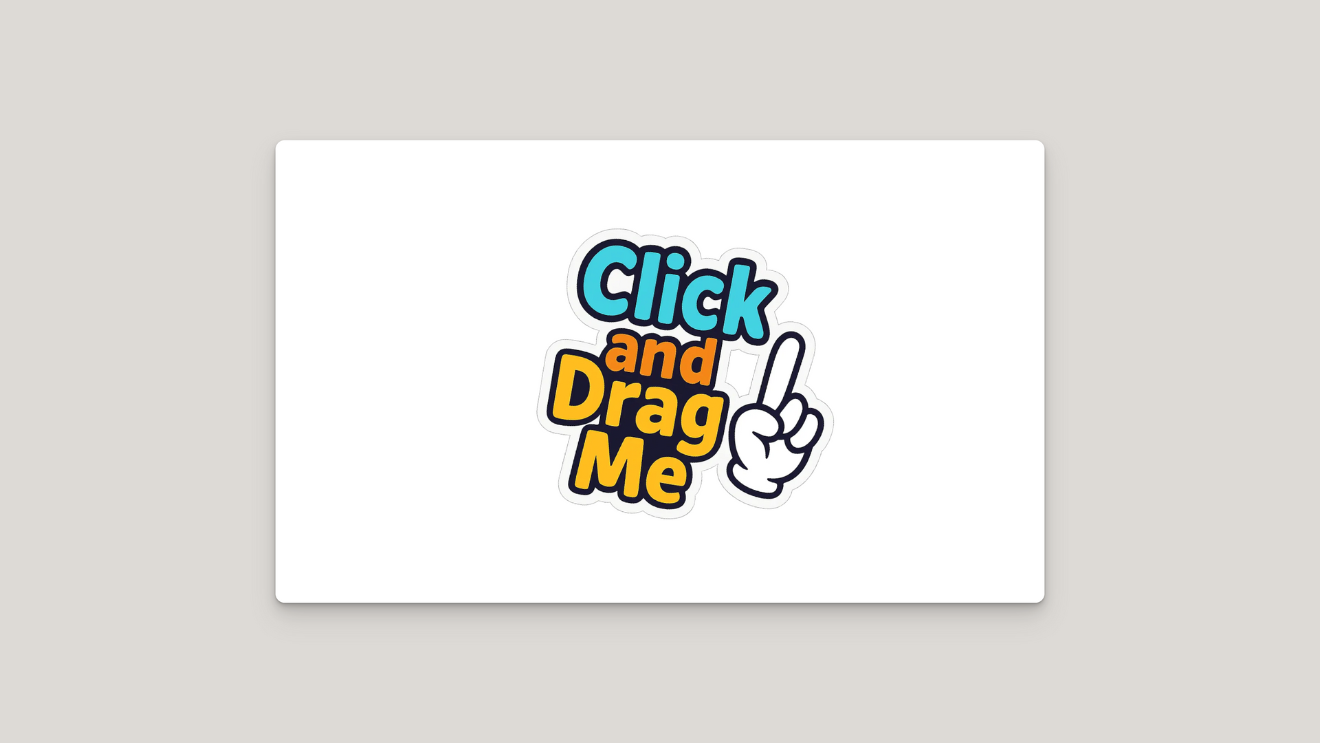
Draggable Image Widget creates an interactive floating image element that users can freely drag and position anywhere on the screen. When implemented, the image appears at your chosen starting position and responds to both mouse and touch interactions with smooth, natural movement. Perfect for adding playful stickers, floating CTAs, watermarks, or interactive design elements that enhance user engagement. Features include customizable hover effects, rotation angles, viewport constraints, and multiple cursor styles. Self-contained implementation with pure JavaScript and CSS, requiring no external libraries while supporting multiple instances on the same page.

NO-ACCESS
Only for Desktop Users
This page is only available on desktop.
Please Log in on a desktop to gain access.