Member
Account Settings
Share AgencyGenius
Know someone who might benefit from AgencyGenius? We'd love it if you shared our platform with your networking group!
Documentation
Step 1: Add HTML, Css & JavaScript
 <!--
 Responsive iFrame Widget with Device Detection & Fallbacks
 Each widget is completely self-contained and can be used multiple times on a page
 Automatically loads desktop or mobile version based on user's device
 -->
 <div id="responsive-iframe-widget-v1" class="custom-iframe-widget" data-iframe-url="https://link.flexmls.com/1atyyrzcmmxd,12" data-mobile-url-pattern="auto" data-aspect-ratio="full">
 <!-- iFrame Container with loading message and error fallback -->
 <div class="iframe-container">
 <div class="iframe-loading">
 Loading content...
 </div>
 <div class="iframe-error">
 <h3>
 Unable to display content
 </h3>
 <p>
 This website cannot be displayed in an iframe due to security restrictions set by the website owner.
 </p>
 <a href="" class="direct-link visit-button" target="_blank">
 Visit the website directly
 </a>
 </div>
 <!-- Device indicator removed -->
 <iframe class="iframe-content" src="" title="Embedded Content" loading="lazy" allowfullscreen="true" allow="payment" referrerpolicy="no-referrer" sandbox="allow-same-origin allow-scripts allow-forms allow-popups">
 </iframe>
 </div>
 <!-- Controls that appear on hover in the top right corner -->
 <div class="iframe-controls">
 <button class="reload-iframe" title="Refresh content">
 ↻
 </button>
 <button class="fullscreen-iframe" title="View fullscreen">
 ⤢
 </button>
 <button class="toggle-device" title="Toggle desktop/mobile view">
 📱
 </button>
 </div>
 </div>
 /* Scoped styles for this widget instance */
 #responsive-iframe-widget-v1.custom-iframe-widget {
 width: 100%;
 max-width: 100%;
 margin: 0 auto;
 position: relative;
 overflow: hidden;
 height: 100%;
 display: flex;
 flex-direction: column;
 }
 #responsive-iframe-widget-v1 .iframe-container {
 position: relative;
 width: 100%;
 height: 100%; /* Full height instead of aspect ratio */
 min-height: 400px; /* Minimum height to ensure visibility */
 overflow: hidden;
 background-color: #f5f5f5;
 }
 #responsive-iframe-widget-v1 .iframe-content {
 position: absolute;
 top: 0;
 left: 0;
 width: 100%;
 height: 100%;
 border: 0;
 transition: opacity 0.3s ease;
 }
 #responsive-iframe-widget-v1 .iframe-loading {
 position: absolute;
 top: 50%;
 left: 50%;
 transform: translate(-50%, -50%);
 font-size: 14px;
 color: #555;
 }
 #responsive-iframe-widget-v1 .iframe-controls {
 position: absolute;
 top: 10px;
 right: 10px;
 display: flex;
 z-index: 10;
 opacity: 0;
 transition: opacity 0.3s ease;
 }
 #responsive-iframe-widget-v1:hover .iframe-controls {
 opacity: 1;
 }
 #responsive-iframe-widget-v1 .iframe-controls button {
 background-color: rgba(0, 0, 0, 0.6);
 color: white;
 border: none;
 padding: 6px 10px;
 margin-left: 5px;
 cursor: pointer;
 font-size: 12px;
 border-radius: 3px;
 backdrop-filter: blur(2px);
 transition: background-color 0.2s ease;
 }
 #responsive-iframe-widget-v1 .iframe-controls button:hover {
 background-color: rgba(0, 0, 0, 0.8);
 }
 #responsive-iframe-widget-v1 .device-toggle {
 padding: 6px 10px;
 background-color: rgba(0, 0, 0, 0.6);
 color: white;
 border: none;
 cursor: pointer;
 font-size: 12px;
 border-radius: 3px;
 margin-left: 5px;
 }
 #responsive-iframe-widget-v1 .iframe-error {
 position: absolute;
 top: 0;
 left: 0;
 width: 100%;
 height: 100%;
 background-color: #f8f8f8;
 display: none;
 flex-direction: column;
 justify-content: center;
 align-items: center;
 padding: 30px;
 text-align: center;
 font-family: Arial, sans-serif;
 box-sizing: border-box;
 }
 #responsive-iframe-widget-v1 .iframe-error h3 {
 margin-top: 0;
 margin-bottom: 15px;
 color: #333;
 font-size: 18px;
 }
 #responsive-iframe-widget-v1 .iframe-error p {
 margin-bottom: 20px;
 color: #555;
 max-width: 400px;
 line-height: 1.5;
 }
 #responsive-iframe-widget-v1 .visit-button {
 display: inline-block;
 padding: 8px 16px;
 background-color: #0078d4;
 color: white;
 text-decoration: none;
 border-radius: 4px;
 font-weight: bold;
 transition: background-color 0.2s ease;
 }
 #responsive-iframe-widget-v1 .visit-button:hover {
 background-color: #0063b1;
 }
 /* Device indicator removed */
 @media (max-width: 768px) {
 #responsive-iframe-widget-v1 .iframe-container {
 min-height: 300px; /* Smaller minimum height on mobile */
 }
 /* Only apply aspect ratio if it's being used */
 #responsive-iframe-widget-v1.use-aspect-ratio .iframe-container {
 padding-bottom: 75%; /* 4:3 aspect ratio for mobile */
 height: 0;
 }
 }
 // Self-executing function to create a closure for this widget instance
 (function() {
 // Get the containing widget
 const widget = document.currentScript.parentNode;

 // Configuration from data attributes
 const config = {
 desktopUrl: widget.getAttribute('data-iframe-url') || '',
 mobileUrlPattern: widget.getAttribute('data-mobile-url-pattern') || 'auto',
 mobileCustomUrl: widget.getAttribute('data-mobile-url') || '',
 aspectRatio: widget.getAttribute('data-aspect-ratio') || '16:9',
 mobileScale: parseFloat(widget.getAttribute('data-mobile-scale') || 0.8),
 mobileBreakpoint: parseInt(widget.getAttribute('data-mobile-breakpoint') || 768),
 cropTop: parseInt(widget.getAttribute('data-crop-top') || 0),
 cropBottom: parseInt(widget.getAttribute('data-crop-bottom') || 0),
 cropLeft: parseInt(widget.getAttribute('data-crop-left') || 0),
 cropRight: parseInt(widget.getAttribute('data-crop-right') || 0)
 };

 // Get elements within this widget instance
 const container = widget.querySelector('.iframe-container');
 const iframe = widget.querySelector('.iframe-content');
 const loadingIndicator = widget.querySelector('.iframe-loading');
 const errorDisplay = widget.querySelector('.iframe-error');
 const reloadButton = widget.querySelector('.reload-iframe');
 const fullscreenButton = widget.querySelector('.fullscreen-iframe');
 const toggleDeviceButton = widget.querySelector('.toggle-device');
 const directLink = widget.querySelector('.direct-link');
 // Device indicator removed

 // Current device mode
 let currentMode = 'desktop';
 let forceMode = null;

 // Detect if the user is on a mobile device
 const isMobileDevice = () => {
 return /Android|webOS|iPhone|iPad|iPod|BlackBerry|IEMobile|Opera Mini/i.test(navigator.userAgent) || window.innerWidth <= config.mobileBreakpoint;
 };

 // Set the initial device mode based on the user's device
 if (isMobileDevice() && !forceMode) {
 currentMode = 'mobile';
 }

 // Mobile URL transformation strategies
 const mobileUrlStrategies = {
 mSubdomain: (url) => {
 const urlObj = new URL(url);
 const hostname = urlObj.hostname.replace('www.', '');
 urlObj.hostname = `m.${hostname}`;
 return urlObj.toString();
 },

 addViewParameter: (url) => {
 const urlObj = new URL(url);
 urlObj.searchParams.append('view', 'mobile');
 return urlObj.toString();
 },

 addMobileParameter: (url) => {
 const urlObj = new URL(url);
 urlObj.searchParams.append('mobile', 'true');
 return urlObj.toString();
 },

 // Fallback to original desktop URL
 desktop: (url) => {
 return url;
 }
 };

 // Available fallback strategies, in order of priority
 const fallbackStrategies = ['mSubdomain', 'addViewParameter', 'addMobileParameter', 'desktop'];
 let currentStrategyIndex = 0;

 // Transform URL for mobile devices
 const getMobileUrl = (desktopUrl) => {
 // If a custom mobile URL is provided, use it
 if (config.mobileCustomUrl) {
 return config.mobileCustomUrl;
 }

 try {
 // Use current strategy
 const strategy = fallbackStrategies[currentStrategyIndex];
 return mobileUrlStrategies[strategy](desktopUrl);
 } catch (e) {
 console.error('Error transforming URL', e);
 return desktopUrl;
 }
 };

 // Function to update the iframe source based on current mode
 const updateIframeSource = () => {
 const isCurrentlyMobile = forceMode ? forceMode === 'mobile' : (isMobileDevice() && currentMode === 'mobile');

 // Change the button icon based on current mode
 toggleDeviceButton.textContent = isCurrentlyMobile ? '🖥️' : '📱';
 toggleDeviceButton.title = isCurrentlyMobile ? 'Switch to desktop view' : 'Switch to mobile view';

 // Update the iframe source based on the current mode
 const url = isCurrentlyMobile ? getMobileUrl(config.desktopUrl) : config.desktopUrl;

 // Only reload if the URL is different
 if (iframe.src !== url && url) {
 loadingIndicator.style.display = 'block';
 errorDisplay.style.display = 'none';
 iframe.src = url;

 // Reset error detection for new load
 clearTimeout(window.errorDetectionTimeout);
 window.errorDetectionTimeout = setTimeout(checkIframeLoaded, 3000);

 // Update direct link
 if (directLink) {
 directLink.href = url;
 }
 }
 };

 // Check if iframe loaded correctly and implement fallback if needed
 function checkIframeLoaded() {
 try {
 // Try to access iframe content - will fail if blocked by X-Frame-Options
 const iframeContent = iframe.contentWindow.document;
 if (!iframeContent) {
 handleError();
 }
 } catch (e) {
 // Access denied due to same-origin policy or loading failed
 handleError();
 }
 }

 // Toggle between desktop and mobile view
 const toggleDeviceView = () => {
 forceMode = forceMode === 'mobile' ? 'desktop' : 'mobile';
 // Reset strategy index when manually switching
 currentStrategyIndex = 0;
 updateIframeSource();
 };

 // Set up toggle device event listener
 if (toggleDeviceButton) {
 toggleDeviceButton.addEventListener('click', toggleDeviceView);
 }

 // Set up initial iframe source and direct link URL
 updateIframeSource();

 // Clear any previous timeouts
 clearTimeout(window.errorDetectionTimeout);

 // Handle iframe load event
 iframe.addEventListener('load', function() {
 loadingIndicator.style.display = 'none';
 // Clear error detection timeout as load was successful
 clearTimeout(window.errorDetectionTimeout);
 });

 // Handle iframe load errors
 iframe.addEventListener('error', function() {
 handleError();
 });

 // Apply aspect ratio
 if (config.aspectRatio && config.aspectRatio !== 'full') {
 // Use aspect ratio if specified (and not 'full')
 container.style.height = '0';
 let paddingPercentage = '56.25%'; // Default 16:9
 if (config.aspectRatio === '4:3') {
 paddingPercentage = '75%';
 } else if (config.aspectRatio === '1:1') {
 paddingPercentage = '100%';
 }
 container.style.paddingBottom = paddingPercentage;
 } else {
 // Use full height
 container.style.height = '100%';
 container.style.paddingBottom = '0';
 }

 // Apply content cropping
 if (config.cropTop) iframe.style.top = `-${config.cropTop}px`;
 if (config.cropBottom) iframe.style.bottom = `-${config.cropBottom}px`;
 if (config.cropLeft) iframe.style.left = `-${config.cropLeft}px`;
 if (config.cropRight) iframe.style.right = `-${config.cropRight}px`;

 // Handle errors and implement fallback strategy
 function handleError() {
 // If we're in mobile mode and have more strategies to try
 if (currentMode === 'mobile' && currentStrategyIndex < fallbackStrategies.length - 1) {
 // Try next strategy
 currentStrategyIndex++;
 console.log(`Mobile strategy failed, trying next option: ${fallbackStrategies[currentStrategyIndex]}`);

 // If we've reached desktop fallback, show a brief message
 if (fallbackStrategies[currentStrategyIndex] === 'desktop') {
 loadingIndicator.textContent = "Mobile version not available, loading desktop version...";
 setTimeout(() => {
 updateIframeSource();
 }, 1500); // Show message briefly
 } else {
 updateIframeSource();
 }
 } else {
 // Show error if all strategies failed or if it's a genuine error in desktop mode
 loadingIndicator.style.display = 'none';
 errorDisplay.style.display = 'flex';
 }
 }

 // Apply mobile scaling if needed
 function handleResponsive() {
 // Update the device mode if appropriate
 if (!forceMode) {
 const shouldBeMobile = isMobileDevice();
 if (shouldBeMobile && currentMode !== 'mobile') {
 currentMode = 'mobile';
 updateIframeSource();
 } else if (!shouldBeMobile && currentMode !== 'desktop') {
 currentMode = 'desktop';
 updateIframeSource();
 }
 }

 // Scale content inside iframe if needed
 if (window.innerWidth <= config.mobileBreakpoint) {
 iframe.style.transform = `scale(${config.mobileScale})`;
 iframe.style.transformOrigin = 'top left';
 iframe.style.width = `${100 / config.mobileScale}%`;
 iframe.style.height = `${100 / config.mobileScale}%`;
 } else {
 iframe.style.transform = 'none';
 iframe.style.width = '100%';
 iframe.style.height = '100%';
 }
 }

 // Listen for window resize
 window.addEventListener('resize', handleResponsive);

 // Initialize responsive handling
 handleResponsive();

 // Set aspect ratio class if needed
 if (config.aspectRatio && config.aspectRatio !== 'full') {
 widget.classList.add('use-aspect-ratio');
 }
 })();
 <div id="snippet-xagbcu36">
 <!-- HTML SECTION START -->
 <!--
 Responsive iFrame Widget with Device Detection & Fallbacks
 Each widget is completely self-contained and can be used multiple times on a page
 Automatically loads desktop or mobile version based on user's device
 -->
 <div id="responsive-iframe-widget-v1" class="custom-iframe-widget" data-iframe-url="https://link.flexmls.com/1atyyrzcmmxd,12" data-mobile-url-pattern="auto" data-aspect-ratio="full">
 <!-- iFrame Container with loading message and error fallback -->
 <div class="iframe-container">
 <div class="iframe-loading">
 Loading content...
 </div>
 <div class="iframe-error">
 <h3>
 Unable to display content
 </h3>
 <p>
 This website cannot be displayed in an iframe due to security restrictions set by the website owner.
 </p>
 <a href="" class="direct-link visit-button" target="_blank">
 Visit the website directly
 </a>
 </div>
 <!-- Device indicator removed -->
 <iframe class="iframe-content" src="" title="Embedded Content" loading="lazy" allowfullscreen="true" allow="payment" referrerpolicy="no-referrer" sandbox="allow-same-origin allow-scripts allow-forms allow-popups">
 </iframe>
 </div>
 <!-- Controls that appear on hover in the top right corner -->
 <div class="iframe-controls">
 <button class="reload-iframe" title="Refresh content">
 ↻
 </button>
 <button class="fullscreen-iframe" title="View fullscreen">
 ⤢
 </button>
 <button class="toggle-device" title="Toggle desktop/mobile view">
 📱
 </button>
 </div>
 </div>
 <!-- HTML SECTION END -->

 <!-- CSS SECTION START -->
 <style>
 /* Scoped styles for this widget instance */
 #responsive-iframe-widget-v1.custom-iframe-widget {
 width: 100%;
 max-width: 100%;
 margin: 0 auto;
 position: relative;
 overflow: hidden;
 height: 100%;
 display: flex;
 flex-direction: column;
 }
 #responsive-iframe-widget-v1 .iframe-container {
 position: relative;
 width: 100%;
 height: 100%; /* Full height instead of aspect ratio */
 min-height: 400px; /* Minimum height to ensure visibility */
 overflow: hidden;
 background-color: #f5f5f5;
 }
 #responsive-iframe-widget-v1 .iframe-content {
 position: absolute;
 top: 0;
 left: 0;
 width: 100%;
 height: 100%;
 border: 0;
 transition: opacity 0.3s ease;
 }
 #responsive-iframe-widget-v1 .iframe-loading {
 position: absolute;
 top: 50%;
 left: 50%;
 transform: translate(-50%, -50%);
 font-size: 14px;
 color: #555;
 }
 #responsive-iframe-widget-v1 .iframe-controls {
 position: absolute;
 top: 10px;
 right: 10px;
 display: flex;
 z-index: 10;
 opacity: 0;
 transition: opacity 0.3s ease;
 }
 #responsive-iframe-widget-v1:hover .iframe-controls {
 opacity: 1;
 }
 #responsive-iframe-widget-v1 .iframe-controls button {
 background-color: rgba(0, 0, 0, 0.6);
 color: white;
 border: none;
 padding: 6px 10px;
 margin-left: 5px;
 cursor: pointer;
 font-size: 12px;
 border-radius: 3px;
 backdrop-filter: blur(2px);
 transition: background-color 0.2s ease;
 }
 #responsive-iframe-widget-v1 .iframe-controls button:hover {
 background-color: rgba(0, 0, 0, 0.8);
 }
 #responsive-iframe-widget-v1 .device-toggle {
 padding: 6px 10px;
 background-color: rgba(0, 0, 0, 0.6);
 color: white;
 border: none;
 cursor: pointer;
 font-size: 12px;
 border-radius: 3px;
 margin-left: 5px;
 }
 #responsive-iframe-widget-v1 .iframe-error {
 position: absolute;
 top: 0;
 left: 0;
 width: 100%;
 height: 100%;
 background-color: #f8f8f8;
 display: none;
 flex-direction: column;
 justify-content: center;
 align-items: center;
 padding: 30px;
 text-align: center;
 font-family: Arial, sans-serif;
 box-sizing: border-box;
 }
 #responsive-iframe-widget-v1 .iframe-error h3 {
 margin-top: 0;
 margin-bottom: 15px;
 color: #333;
 font-size: 18px;
 }
 #responsive-iframe-widget-v1 .iframe-error p {
 margin-bottom: 20px;
 color: #555;
 max-width: 400px;
 line-height: 1.5;
 }
 #responsive-iframe-widget-v1 .visit-button {
 display: inline-block;
 padding: 8px 16px;
 background-color: #0078d4;
 color: white;
 text-decoration: none;
 border-radius: 4px;
 font-weight: bold;
 transition: background-color 0.2s ease;
 }
 #responsive-iframe-widget-v1 .visit-button:hover {
 background-color: #0063b1;
 }
 /* Device indicator removed */
 @media (max-width: 768px) {
 #responsive-iframe-widget-v1 .iframe-container {
 min-height: 300px; /* Smaller minimum height on mobile */
 }
 /* Only apply aspect ratio if it's being used */
 #responsive-iframe-widget-v1.use-aspect-ratio .iframe-container {
 padding-bottom: 75%; /* 4:3 aspect ratio for mobile */
 height: 0;
 }
 }
 </style>
 <!-- CSS SECTION END -->

 <!-- JAVASCRIPT SECTION START -->
 <script>
 // Self-executing function to create a closure for this widget instance
 (function() {
 // Get the containing widget
 const widget = document.currentScript.parentNode;

 // Configuration from data attributes
 const config = {
 desktopUrl: widget.getAttribute('data-iframe-url') || '',
 mobileUrlPattern: widget.getAttribute('data-mobile-url-pattern') || 'auto',
 mobileCustomUrl: widget.getAttribute('data-mobile-url') || '',
 aspectRatio: widget.getAttribute('data-aspect-ratio') || '16:9',
 mobileScale: parseFloat(widget.getAttribute('data-mobile-scale') || 0.8),
 mobileBreakpoint: parseInt(widget.getAttribute('data-mobile-breakpoint') || 768),
 cropTop: parseInt(widget.getAttribute('data-crop-top') || 0),
 cropBottom: parseInt(widget.getAttribute('data-crop-bottom') || 0),
 cropLeft: parseInt(widget.getAttribute('data-crop-left') || 0),
 cropRight: parseInt(widget.getAttribute('data-crop-right') || 0)
 };

 // Get elements within this widget instance
 const container = widget.querySelector('.iframe-container');
 const iframe = widget.querySelector('.iframe-content');
 const loadingIndicator = widget.querySelector('.iframe-loading');
 const errorDisplay = widget.querySelector('.iframe-error');
 const reloadButton = widget.querySelector('.reload-iframe');
 const fullscreenButton = widget.querySelector('.fullscreen-iframe');
 const toggleDeviceButton = widget.querySelector('.toggle-device');
 const directLink = widget.querySelector('.direct-link');
 // Device indicator removed

 // Current device mode
 let currentMode = 'desktop';
 let forceMode = null;

 // Detect if the user is on a mobile device
 const isMobileDevice = () => {
 return /Android|webOS|iPhone|iPad|iPod|BlackBerry|IEMobile|Opera Mini/i.test(navigator.userAgent) || window.innerWidth <= config.mobileBreakpoint;
 };

 // Set the initial device mode based on the user's device
 if (isMobileDevice() && !forceMode) {
 currentMode = 'mobile';
 }

 // Mobile URL transformation strategies
 const mobileUrlStrategies = {
 mSubdomain: (url) => {
 const urlObj = new URL(url);
 const hostname = urlObj.hostname.replace('www.', '');
 urlObj.hostname = `m.${hostname}`;
 return urlObj.toString();
 },

 addViewParameter: (url) => {
 const urlObj = new URL(url);
 urlObj.searchParams.append('view', 'mobile');
 return urlObj.toString();
 },

 addMobileParameter: (url) => {
 const urlObj = new URL(url);
 urlObj.searchParams.append('mobile', 'true');
 return urlObj.toString();
 },

 // Fallback to original desktop URL
 desktop: (url) => {
 return url;
 }
 };

 // Available fallback strategies, in order of priority
 const fallbackStrategies = ['mSubdomain', 'addViewParameter', 'addMobileParameter', 'desktop'];
 let currentStrategyIndex = 0;

 // Transform URL for mobile devices
 const getMobileUrl = (desktopUrl) => {
 // If a custom mobile URL is provided, use it
 if (config.mobileCustomUrl) {
 return config.mobileCustomUrl;
 }

 try {
 // Use current strategy
 const strategy = fallbackStrategies[currentStrategyIndex];
 return mobileUrlStrategies[strategy](desktopUrl);
 } catch (e) {
 console.error('Error transforming URL', e);
 return desktopUrl;
 }
 };

 // Function to update the iframe source based on current mode
 const updateIframeSource = () => {
 const isCurrentlyMobile = forceMode ? forceMode === 'mobile' : (isMobileDevice() && currentMode === 'mobile');

 // Change the button icon based on current mode
 toggleDeviceButton.textContent = isCurrentlyMobile ? '🖥️' : '📱';
 toggleDeviceButton.title = isCurrentlyMobile ? 'Switch to desktop view' : 'Switch to mobile view';

 // Update the iframe source based on the current mode
 const url = isCurrentlyMobile ? getMobileUrl(config.desktopUrl) : config.desktopUrl;

 // Only reload if the URL is different
 if (iframe.src !== url && url) {
 loadingIndicator.style.display = 'block';
 errorDisplay.style.display = 'none';
 iframe.src = url;

 // Reset error detection for new load
 clearTimeout(window.errorDetectionTimeout);
 window.errorDetectionTimeout = setTimeout(checkIframeLoaded, 3000);

 // Update direct link
 if (directLink) {
 directLink.href = url;
 }
 }
 };

 // Check if iframe loaded correctly and implement fallback if needed
 function checkIframeLoaded() {
 try {
 // Try to access iframe content - will fail if blocked by X-Frame-Options
 const iframeContent = iframe.contentWindow.document;
 if (!iframeContent) {
 handleError();
 }
 } catch (e) {
 // Access denied due to same-origin policy or loading failed
 handleError();
 }
 }

 // Toggle between desktop and mobile view
 const toggleDeviceView = () => {
 forceMode = forceMode === 'mobile' ? 'desktop' : 'mobile';
 // Reset strategy index when manually switching
 currentStrategyIndex = 0;
 updateIframeSource();
 };

 // Set up toggle device event listener
 if (toggleDeviceButton) {
 toggleDeviceButton.addEventListener('click', toggleDeviceView);
 }

 // Set up initial iframe source and direct link URL
 updateIframeSource();

 // Clear any previous timeouts
 clearTimeout(window.errorDetectionTimeout);

 // Handle iframe load event
 iframe.addEventListener('load', function() {
 loadingIndicator.style.display = 'none';
 // Clear error detection timeout as load was successful
 clearTimeout(window.errorDetectionTimeout);
 });

 // Handle iframe load errors
 iframe.addEventListener('error', function() {
 handleError();
 });

 // Apply aspect ratio
 if (config.aspectRatio && config.aspectRatio !== 'full') {
 // Use aspect ratio if specified (and not 'full')
 container.style.height = '0';
 let paddingPercentage = '56.25%'; // Default 16:9
 if (config.aspectRatio === '4:3') {
 paddingPercentage = '75%';
 } else if (config.aspectRatio === '1:1') {
 paddingPercentage = '100%';
 }
 container.style.paddingBottom = paddingPercentage;
 } else {
 // Use full height
 container.style.height = '100%';
 container.style.paddingBottom = '0';
 }

 // Apply content cropping
 if (config.cropTop) iframe.style.top = `-${config.cropTop}px`;
 if (config.cropBottom) iframe.style.bottom = `-${config.cropBottom}px`;
 if (config.cropLeft) iframe.style.left = `-${config.cropLeft}px`;
 if (config.cropRight) iframe.style.right = `-${config.cropRight}px`;

 // Handle errors and implement fallback strategy
 function handleError() {
 // If we're in mobile mode and have more strategies to try
 if (currentMode === 'mobile' && currentStrategyIndex < fallbackStrategies.length - 1) {
 // Try next strategy
 currentStrategyIndex++;
 console.log(`Mobile strategy failed, trying next option: ${fallbackStrategies[currentStrategyIndex]}`);

 // If we've reached desktop fallback, show a brief message
 if (fallbackStrategies[currentStrategyIndex] === 'desktop') {
 loadingIndicator.textContent = "Mobile version not available, loading desktop version...";
 setTimeout(() => {
 updateIframeSource();
 }, 1500); // Show message briefly
 } else {
 updateIframeSource();
 }
 } else {
 // Show error if all strategies failed or if it's a genuine error in desktop mode
 loadingIndicator.style.display = 'none';
 errorDisplay.style.display = 'flex';
 }
 }

 // Apply mobile scaling if needed
 function handleResponsive() {
 // Update the device mode if appropriate
 if (!forceMode) {
 const shouldBeMobile = isMobileDevice();
 if (shouldBeMobile && currentMode !== 'mobile') {
 currentMode = 'mobile';
 updateIframeSource();
 } else if (!shouldBeMobile && currentMode !== 'desktop') {
 currentMode = 'desktop';
 updateIframeSource();
 }
 }

 // Scale content inside iframe if needed
 if (window.innerWidth <= config.mobileBreakpoint) {
 iframe.style.transform = `scale(${config.mobileScale})`;
 iframe.style.transformOrigin = 'top left';
 iframe.style.width = `${100 / config.mobileScale}%`;
 iframe.style.height = `${100 / config.mobileScale}%`;
 } else {
 iframe.style.transform = 'none';
 iframe.style.width = '100%';
 iframe.style.height = '100%';
 }
 }

 // Listen for window resize
 window.addEventListener('resize', handleResponsive);

 // Initialize responsive handling
 handleResponsive();

 // Set aspect ratio class if needed
 if (config.aspectRatio && config.aspectRatio !== 'full') {
 widget.classList.add('use-aspect-ratio');
 }
 })();
 </script>
 <!-- JAVASCRIPT SECTION END -->
 </div>
Responsive iFrame Widget
The Responsive iFrame Widget creates a smart embedded frame that automatically detects the user's device and loads either desktop or mobile versions of websites. The widget is fully responsive, self-contained, and includes intelligent fallback systems to ensure content displays properly.
Key Features
- Automatic device detection loads appropriate content version
- Smart fallback system tries multiple mobile approaches before reverting to desktop
- Full-height container adapts to its parent element
- Controls for refresh, fullscreen, and toggling device view
- Error handling with friendly fallback messages
- Completely self-contained for easy implementation
HTML Structure
The widget consists of a main container with nested elements:
- Main container div.custom-iframe-widget with configuration data attributes
- Inner .iframe-container houses the iframe and messages
- Loading indicator shows while content loads
- Error display appears if content can't be embedded
- The actual iframe.iframe-content element
- Control buttons in .iframe-controls container
Configuration Options
Configure the widget using these data attributes:
- data-iframe-url : Desktop URL to embed (required)
- data-mobile-url : Specific mobile URL (optional)
- data-mobile-url-pattern : How to transform URLs (default: "auto")
- data-aspect-ratio : Set to "full" for 100% height or "16:9", "4:3", "1:1"
- data-mobile-scale : Scaling factor for mobile (default: 0.8)
- data-mobile-breakpoint : Screen width threshold (default: 768px)
- data-crop-top , data-crop-bottom , data-crop-left , data-crop-right : Crop the iframe content (in pixels)
Mobile Detection & Fallbacks
The widget uses a smart system to ensure mobile content displays properly:
- Automatically detects mobile devices via user agent and screen width
- Sequentially tries these strategies for mobile URLs:
- Using m. subdomain (e.g., m.example.com)
- Adding view=mobile parameter
- Adding mobile=true parameter
- Falling back to desktop version if all mobile approaches fail
- Shows a brief message when falling back: "Mobile version not available, loading desktop version..."
Height Control
The widget adapts to whatever height you provide:
- Set data-aspect-ratio="full" (default) for 100% height mode
- Control height by setting dimensions on the parent container:
- Fixed height: <div style="height: 600px;">
- Viewport percentage: <div style="height: 80vh;">
- Responsive height: <div style="height: calc(100vh - 80px);">
- Or use aspect ratios like data-aspect-ratio="16:9"
Basic Implementation
Add this code to your page, customizing the URL:
<div id="responsive-iframe-widget-v1" class="custom-iframe-widget" data-iframe-url="https://your-url-here.com" data-aspect-ratio="full">
  <!-- Widget content and code here -->
</div>
Control Features
The widget includes user controls that appear on hover:
- ↻ Refresh button: Reloads the iframe content
- ⤢ Fullscreen button: Expands iframe to fullscreen
- 📱 / 🖥️ Toggle button: Switches between mobile and desktop views
Error Handling
The widget handles various error conditions:
- Shows a loading indicator while content loads
- Displays an error message if the site blocks embedding
- Provides a direct link to visit the site in a new tab
- Automatically tries fallback strategies for mobile content
Multiple Instances
To use multiple widgets on the same page:
- Each instance is completely self-contained
- Use different IDs for each instance
- Configure each instance with its own data attributes
- No conflicts between multiple widgets

How to edit code using AI →
Resource Details:
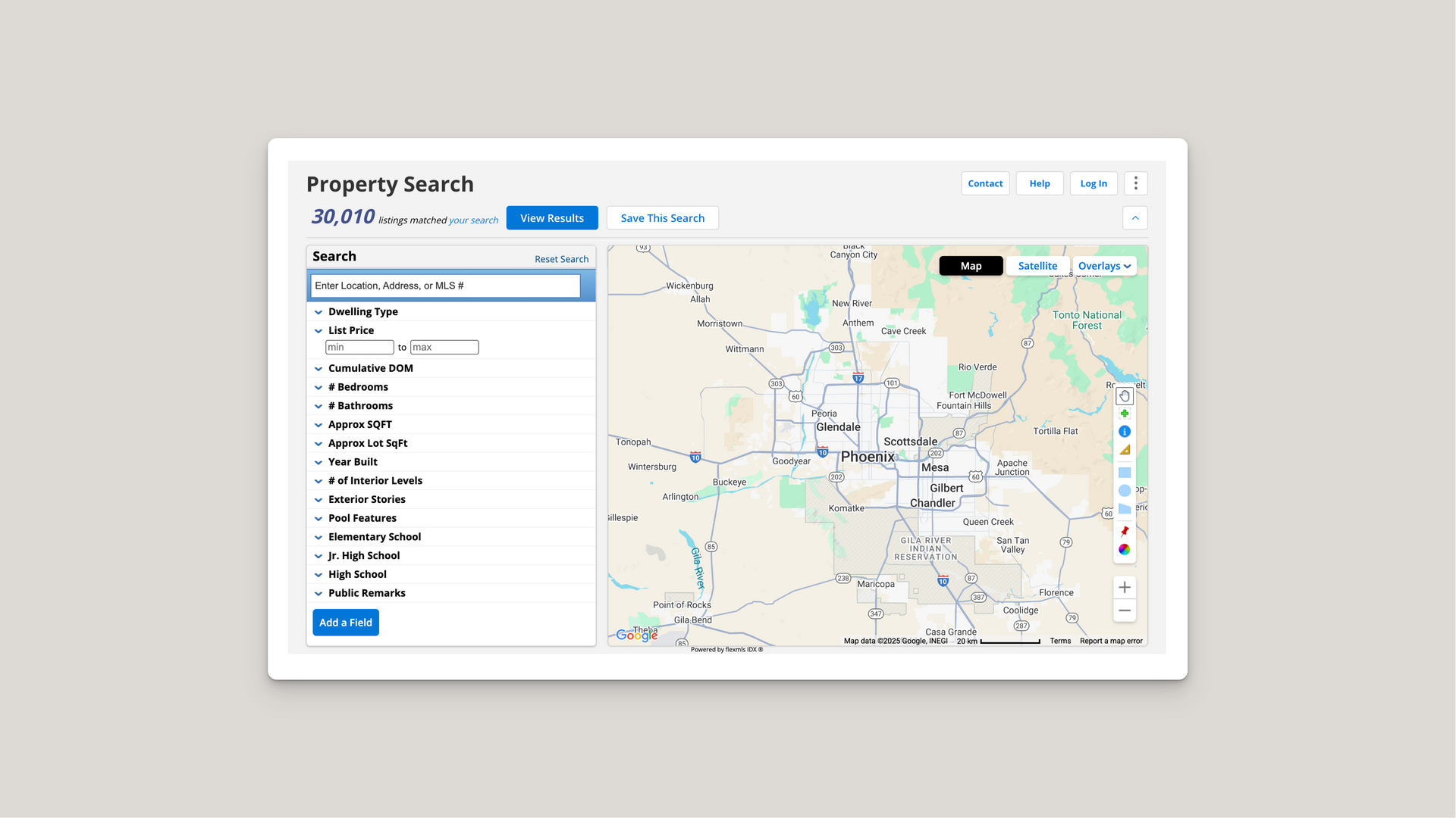
Responsive iFrame Widget embeds external content seamlessly into your website. Display third-party services with hover controls for refresh and fullscreen viewing. Features intelligent error handling for restricted content, responsive sizing for all devices, and smooth hover transitions. Multi-instance support allows multiple independent iFrames on one page. Simple implementation with data attribute configuration for URLs, aspect ratios, and content positioning. Works with real estate listings, maps, booking systems, and more.

NO-ACCESS
Only for Desktop Users
This page is only available on desktop.
Please Log in on a desktop to gain access.