Member
Account Settings
Share AgencyGenius
Know someone who might benefit from AgencyGenius? We'd love it if you shared our platform with your networking group!
Documentation
Tool
We've listed the code documentation below, although we've also created a DIY tool that allows you to create your own infinity text sliders on the 'Tool' tab above.
Step 1: Add HTML, Css
 <div id="ag-scroller-m9lsa6as-exlv7x">
 <div class="scroller-track">
 <!-- First set of content -->
 <div class="content-group content-group-1" style="margin-right: 20px;">
 COLLECTIONS
 </div>
 <div class="divider" style="margin-right: 20px;">
 👕
 </div>
 <div class="content-group content-group-2" style="margin-right: 20px;">
 COLLECTIONS
 </div>
 <div class="divider" style="margin-right: 20px;">
 👕
 </div>
 <div class="content-group content-group-3" style="margin-right: 20px;">
 COLLECTIONS
 </div>
 <div class="divider" style="margin-right: 20px;">
 👕
 </div>
 <div class="content-group content-group-4" style="margin-right: 20px;">
 COLLECTIONS
 </div>
 <div class="divider" style="margin-right: 20px;">
 👕
 </div>
 <div class="content-group content-group-5" style="margin-right: 20px;">
 COLLECTIONS
 </div>
 <div class="divider" style="margin-right: 20px;">
 👕
 </div>
 <div class="content-group content-group-6" style="margin-right: 20px;">
 COLLECTIONS
 </div>
 <div class="divider" style="margin-right: 20px;">
 👕
 </div>
 <div class="content-group content-group-7" style="margin-right: 20px;">
 COLLECTIONS
 </div>
 <div class="divider" style="margin-right: 20px;">
 👕
 </div>
 <div class="content-group content-group-8" style="margin-right: 20px;">
 COLLECTIONS
 </div>
 <div class="divider" style="margin-right: 20px;">
 👕
 </div>
 <div class="content-group content-group-9" style="margin-right: 20px;">
 COLLECTIONS
 </div>
 <div class="divider" style="margin-right: 20px;">
 👕
 </div>
 <div class="content-group content-group-10" style="margin-right: 20px;">
 COLLECTIONS
 </div>
 <div class="divider" style="margin-right: 20px;">
 👕
 </div>

 <!-- Second set of content (duplicate for continuous effect) -->
 <div class="content-group content-group-1" style="margin-right: 20px;">
 COLLECTIONS
 </div>
 <div class="divider" style="margin-right: 20px;">
 👕
 </div>
 <div class="content-group content-group-2" style="margin-right: 20px;">
 COLLECTIONS
 </div>
 <div class="divider" style="margin-right: 20px;">
 👕
 </div>
 <div class="content-group content-group-3" style="margin-right: 20px;">
 COLLECTIONS
 </div>
 <div class="divider" style="margin-right: 20px;">
 👕
 </div>
 <div class="content-group content-group-4" style="margin-right: 20px;">
 COLLECTIONS
 </div>
 <div class="divider" style="margin-right: 20px;">
 👕
 </div>
 <div class="content-group content-group-5" style="margin-right: 20px;">
 COLLECTIONS
 </div>
 <div class="divider" style="margin-right: 20px;">
 👕
 </div>
 <div class="content-group content-group-6" style="margin-right: 20px;">
 COLLECTIONS
 </div>
 <div class="divider" style="margin-right: 20px;">
 👕
 </div>
 <div class="content-group content-group-7" style="margin-right: 20px;">
 COLLECTIONS
 </div>
 <div class="divider" style="margin-right: 20px;">
 👕
 </div>
 <div class="content-group content-group-8" style="margin-right: 20px;">
 COLLECTIONS
 </div>
 <div class="divider" style="margin-right: 20px;">
 👕
 </div>
 <div class="content-group content-group-9" style="margin-right: 20px;">
 COLLECTIONS
 </div>
 <div class="divider" style="margin-right: 20px;">
 👕
 </div>
 <div class="content-group content-group-10" style="margin-right: 20px;">
 COLLECTIONS
 </div>
 <div class="divider" style="margin-right: 20px;">
 👕
 </div>
 </div>
 </div>
 /* Text Scroller Main Styles */
 #ag-scroller-m9lsa6as-exlv7x {
 width: 100%;
 height: 71px;
 overflow: hidden;
 position: relative;
 background-color: #000000;
 border-radius: 0px;
 display: flex;
 align-items: center;
 }
 #ag-scroller-m9lsa6as-exlv7x .scroller-track {
 display: flex;
 width: max-content;
 animation: ag-scroller-m9lsa6as-exlv7x-scroll 40s linear infinite;
 animation-direction: normal;
 align-items: center;
 }

 /* Pause on hover effect */
 #ag-scroller-m9lsa6as-exlv7x:hover .scroller-track {
 animation-play-state: paused;
 }

 /* Content Group Styles */
 #ag-scroller-m9lsa6as-exlv7x .content-group {
 display: flex;
 align-items: center;
 padding: 8px 15px;
 font-family: inherit;
 font-size: 42px;
 font-weight: bold;
 color: #ffffff;
 margin-right: 40px;
 white-space: nowrap;
 transition: all 0.3s ease;
 }
 #ag-scroller-m9lsa6as-exlv7x .content-group:hover {
 color: #ad24a6;
 }
 #ag-scroller-m9lsa6as-exlv7x .content-group img {
 vertical-align: middle;
 max-height: 100%;
 width: auto;
 object-fit: contain;
 }
 /* Divider Styles */
 #ag-scroller-m9lsa6as-exlv7x .divider {
 display: flex;
 align-items: center;
 padding: 0 10px;
 font-family: inherit;
 font-size: 42px;
 color: #666;
 white-space: nowrap;
 transition: all 0.3s ease;
 }
 #ag-scroller-m9lsa6as-exlv7x .divider img {
 vertical-align: middle;
 max-height: 100%;
 width: auto;
 object-fit: contain;
 }
 /* Animation keyframes - fixed speed regardless of content amount */
 @keyframes ag-scroller-m9lsa6as-exlv7x-scroll {
 0% { transform: translateX(0); }
 100% { transform: translateX(-50%); }
 }
 /* Responsive styles */
 @media (max-width: 768px) {
 #ag-scroller-m9lsa6as-exlv7x {
 height: 63px;
 }
 #ag-scroller-m9lsa6as-exlv7x .content-group,
 #ag-scroller-m9lsa6as-exlv7x .divider {
 font-size: 37px;
 padding: 6px 12px;
 }
 }
 @media (max-width: 480px) {
 #ag-scroller-m9lsa6as-exlv7x {
 height: 56px;
 }
 #ag-scroller-m9lsa6as-exlv7x .content-group,
 #ag-scroller-m9lsa6as-exlv7x .divider {
 font-size: 33px;
 padding: 4px 10px;
 }
 }
 <div id="snippet-h27r1ies">
 <!-- HTML SECTION START -->
 <div id="ag-scroller-m9lsa6as-exlv7x">
 <div class="scroller-track">
 <!-- First set of content -->
 <div class="content-group content-group-1" style="margin-right: 20px;">
 COLLECTIONS
 </div>
 <div class="divider" style="margin-right: 20px;">
 👕
 </div>
 <div class="content-group content-group-2" style="margin-right: 20px;">
 COLLECTIONS
 </div>
 <div class="divider" style="margin-right: 20px;">
 👕
 </div>
 <div class="content-group content-group-3" style="margin-right: 20px;">
 COLLECTIONS
 </div>
 <div class="divider" style="margin-right: 20px;">
 👕
 </div>
 <div class="content-group content-group-4" style="margin-right: 20px;">
 COLLECTIONS
 </div>
 <div class="divider" style="margin-right: 20px;">
 👕
 </div>
 <div class="content-group content-group-5" style="margin-right: 20px;">
 COLLECTIONS
 </div>
 <div class="divider" style="margin-right: 20px;">
 👕
 </div>
 <div class="content-group content-group-6" style="margin-right: 20px;">
 COLLECTIONS
 </div>
 <div class="divider" style="margin-right: 20px;">
 👕
 </div>
 <div class="content-group content-group-7" style="margin-right: 20px;">
 COLLECTIONS
 </div>
 <div class="divider" style="margin-right: 20px;">
 👕
 </div>
 <div class="content-group content-group-8" style="margin-right: 20px;">
 COLLECTIONS
 </div>
 <div class="divider" style="margin-right: 20px;">
 👕
 </div>
 <div class="content-group content-group-9" style="margin-right: 20px;">
 COLLECTIONS
 </div>
 <div class="divider" style="margin-right: 20px;">
 👕
 </div>
 <div class="content-group content-group-10" style="margin-right: 20px;">
 COLLECTIONS
 </div>
 <div class="divider" style="margin-right: 20px;">
 👕
 </div>

 <!-- Second set of content (duplicate for continuous effect) -->
 <div class="content-group content-group-1" style="margin-right: 20px;">
 COLLECTIONS
 </div>
 <div class="divider" style="margin-right: 20px;">
 👕
 </div>
 <div class="content-group content-group-2" style="margin-right: 20px;">
 COLLECTIONS
 </div>
 <div class="divider" style="margin-right: 20px;">
 👕
 </div>
 <div class="content-group content-group-3" style="margin-right: 20px;">
 COLLECTIONS
 </div>
 <div class="divider" style="margin-right: 20px;">
 👕
 </div>
 <div class="content-group content-group-4" style="margin-right: 20px;">
 COLLECTIONS
 </div>
 <div class="divider" style="margin-right: 20px;">
 👕
 </div>
 <div class="content-group content-group-5" style="margin-right: 20px;">
 COLLECTIONS
 </div>
 <div class="divider" style="margin-right: 20px;">
 👕
 </div>
 <div class="content-group content-group-6" style="margin-right: 20px;">
 COLLECTIONS
 </div>
 <div class="divider" style="margin-right: 20px;">
 👕
 </div>
 <div class="content-group content-group-7" style="margin-right: 20px;">
 COLLECTIONS
 </div>
 <div class="divider" style="margin-right: 20px;">
 👕
 </div>
 <div class="content-group content-group-8" style="margin-right: 20px;">
 COLLECTIONS
 </div>
 <div class="divider" style="margin-right: 20px;">
 👕
 </div>
 <div class="content-group content-group-9" style="margin-right: 20px;">
 COLLECTIONS
 </div>
 <div class="divider" style="margin-right: 20px;">
 👕
 </div>
 <div class="content-group content-group-10" style="margin-right: 20px;">
 COLLECTIONS
 </div>
 <div class="divider" style="margin-right: 20px;">
 👕
 </div>
 </div>
 </div>
 <!-- HTML SECTION END -->

 <!-- CSS SECTION START -->
 <style>
 /* Text Scroller Main Styles */
 #ag-scroller-m9lsa6as-exlv7x {
 width: 100%;
 height: 71px;
 overflow: hidden;
 position: relative;
 background-color: #000000;
 border-radius: 0px;
 display: flex;
 align-items: center;
 }
 #ag-scroller-m9lsa6as-exlv7x .scroller-track {
 display: flex;
 width: max-content;
 animation: ag-scroller-m9lsa6as-exlv7x-scroll 40s linear infinite;
 animation-direction: normal;
 align-items: center;
 }

 /* Pause on hover effect */
 #ag-scroller-m9lsa6as-exlv7x:hover .scroller-track {
 animation-play-state: paused;
 }

 /* Content Group Styles */
 #ag-scroller-m9lsa6as-exlv7x .content-group {
 display: flex;
 align-items: center;
 padding: 8px 15px;
 font-family: inherit;
 font-size: 42px;
 font-weight: bold;
 color: #ffffff;
 margin-right: 40px;
 white-space: nowrap;
 transition: all 0.3s ease;
 }
 #ag-scroller-m9lsa6as-exlv7x .content-group:hover {
 color: #ad24a6;
 }
 #ag-scroller-m9lsa6as-exlv7x .content-group img {
 vertical-align: middle;
 max-height: 100%;
 width: auto;
 object-fit: contain;
 }
 /* Divider Styles */
 #ag-scroller-m9lsa6as-exlv7x .divider {
 display: flex;
 align-items: center;
 padding: 0 10px;
 font-family: inherit;
 font-size: 42px;
 color: #666;
 white-space: nowrap;
 transition: all 0.3s ease;
 }
 #ag-scroller-m9lsa6as-exlv7x .divider img {
 vertical-align: middle;
 max-height: 100%;
 width: auto;
 object-fit: contain;
 }
 /* Animation keyframes - fixed speed regardless of content amount */
 @keyframes ag-scroller-m9lsa6as-exlv7x-scroll {
 0% { transform: translateX(0); }
 100% { transform: translateX(-50%); }
 }
 /* Responsive styles */
 @media (max-width: 768px) {
 #ag-scroller-m9lsa6as-exlv7x {
 height: 63px;
 }
 #ag-scroller-m9lsa6as-exlv7x .content-group,
 #ag-scroller-m9lsa6as-exlv7x .divider {
 font-size: 37px;
 padding: 6px 12px;
 }
 }
 @media (max-width: 480px) {
 #ag-scroller-m9lsa6as-exlv7x {
 height: 56px;
 }
 #ag-scroller-m9lsa6as-exlv7x .content-group,
 #ag-scroller-m9lsa6as-exlv7x .divider {
 font-size: 33px;
 padding: 4px 10px;
 }
 }
 </style>
 <!-- CSS SECTION END -->
 </div>
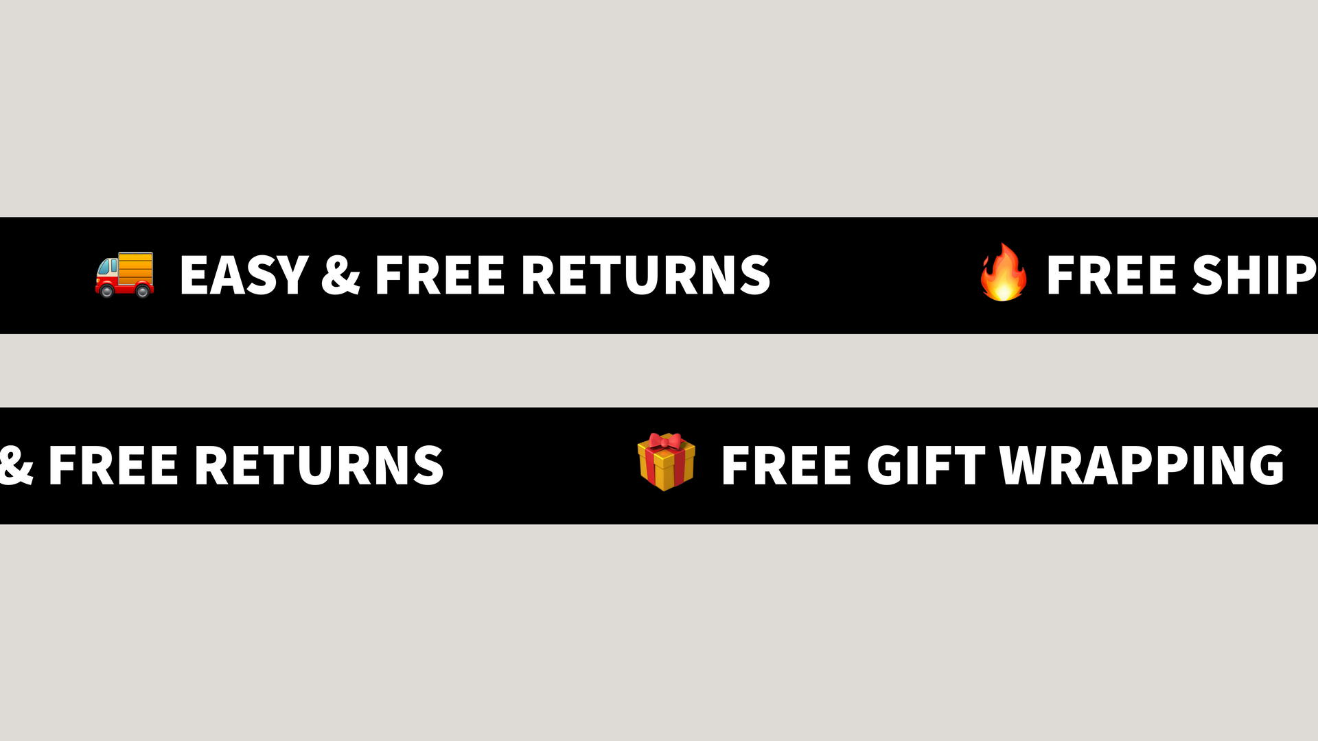
Infinite Text Scroller Overview
The Infinite Text Scroller creates a horizontally scrolling text banner with a continuous animation effect. It's designed to showcase repetitive content in an eye-catching way, commonly used for announcements, branding elements, or highlighting key features.
HTML Structure
The HTML structure is straightforward:
- The main container ag-scroller-m9lsa6as-exlv7x wraps the entire component
- Inside is a .scroller-track div that holds all content
- Content is organized into two types of elements:
- .content-group elements containing the primary text ("COLLECTIONS")
- .divider elements containing emoji separators (👕)
- Content is duplicated to create the seamless looping effect (two identical sets)
CSS Animation
The scrolling effect is achieved entirely through CSS:
- The main container has overflow: hidden to create a viewport window
- The .scroller-track uses width: max-content to accommodate all content
- Animation is applied to the track with animation: ag-scroller-m9lsa6as-exlv7x-scroll 40s linear infinite
- The keyframe animation moves content from right to left by transforming the X position:
- 0% { transform: translateX(0); }
- 100% { transform: translateX(-50%); }
- The -50% value ensures that exactly half of the duplicated content scrolls by, creating a seamless loop
Interactive Features
The scroller includes several user interaction enhancements:
- Pause on hover: animation-play-state: paused stops the animation when users hover over the scroller
- Color change on hover: .content-group:hover { color: #ad24a6; } provides visual feedback
- Smooth transitions: transition: all 0.3s ease ensures changes happen smoothly
Styling Details
The visual design incorporates several key elements:
- Dark background ( #000000 ) with contrasting white text for maximum visibility
- Bold typography with large font size ( 42px ) for impact
- Consistent spacing with margin and padding values maintaining rhythm
- Flexbox layout for vertical alignment of all elements
- Support for both text and image content (with object-fit: contain for images)
Responsive Design
The scroller adapts to different screen sizes using media queries:
- Tablet view ( max-width: 768px
):
- Reduced height ( 63px )
- Smaller font size ( 37px )
- Adjusted padding ( 6px 12px )
- Mobile view ( max-width: 480px
):
- Further reduced height ( 56px )
- Even smaller font size ( 33px )
- Minimal padding ( 4px 10px )
Implementation Benefits
This scroller solution offers several advantages:
- CSS-only animation avoids JavaScript dependencies, improving performance
- Constant speed animation regardless of content length due to percentage-based translation
- Fully responsive design adapts to any container width
- Visual emphasis on content with appropriate spacing and typography
- Self-contained component that can be placed in any position in your layout
- No external libraries required, keeping the implementation lightweight
Customization Options
The scroller can be easily customized in several ways:
- Change animation speed by modifying the 40s value in the animation property
- Adjust colors for background, text, and hover states
- Modify font size, weight, and family to match your design system
- Customize the divider symbol (currently using the 👕 emoji)
- Add border-radius or other styling to change the visual appearance
- Adjust the spacing between content groups for different visual rhythm
- Replace text with images or icons for more visual variety
General Settings
Rounds the corners of the entire scroller background
Note: Higher numbers mean slower animation speed (more seconds to complete one cycle)
Default Text Settings
These settings apply to all content by default. You can override them for individual groups.
Interaction Effects
Choose a color that matches your background for best results
Controls how much of each edge is faded (5-30%)
Divider Settings
Enter any text or emoji to be used as a divider
Content Blocks
Create content blocks for your scroller. Dividers will be placed between each content block automatically.
Using Emojis
You can add emojis directly in your text, but different devices will display different emoji styles. For consistent Apple-style emojis across all devices, download the images from Emojipedia and add them as images.
Generated Code

How to edit code using AI →
Resource Details:
Infinite Text Scroller creates a smooth, continuously moving text banner for your website. Text scrolls horizontally in an endless loop with pause-on-hover functionality and color-change effects. Built with pure CSS animations for optimal performance, it features responsive design for all screen sizes, customizable speed, and styling options. Perfect for announcements, featuring product collections, or highlighting key information with a dynamic, eye-catching presentation.

NO-ACCESS
Only for Desktop Users
This page is only available on desktop.
Please Log in on a desktop to gain access.