Member
Account Settings
Share AgencyGenius
Know someone who might benefit from AgencyGenius? We'd love it if you shared our platform with your networking group!
Documentation
Step 1: Add HTML, Css & JavaScript
 <!-- Start of Generic Profile Button Widget -->
 <div id="profileWidgetWrapper">
 <!-- The Button -->
 <div class="profile-button" id="profileButtonUnique">
 <div class="profile-img-container">
 <div class="profile-img-wrapper">
 <img src="https://irp.cdn-website.com/a778beb9/dms3rep/multi/mountain-scenery-macos-4k-wallpaper-uhdpaper.com-108-0-h.jpg" alt="Profile" class="profile-img">
 </div>
 </div>
 <span class="button-text">
 About me
 </span>
 </div>

 <!-- Side Panel Code -->
 <div class="side-panel" id="sidePanel">
 <div class="side-panel-header">
 <button class="close-button" id="closePanelBtn">
 <svg width="24" height="24" viewBox="0 0 24 24" fill="none" xmlns="http://www.w3.org/2000/svg">
 <path d="M18 6L6 18M6 6L18 18" stroke="black" stroke-width="2" stroke-linecap="round" stroke-linejoin="round"></path>
 </svg>
 </button>
 </div>
 <div class="side-panel-content">
 <div class="side-panel-section">
 <h2>Profile Information</h2>
 <div class="profile-info">
 <div class="profile-image">
 <img src="https://irp.cdn-website.com/a778beb9/dms3rep/multi/mountain-scenery-macos-4k-wallpaper-uhdpaper.com-108-0-h.jpg" alt="Profile Image">
 </div>
 <div class="profile-details">
 <h3>Your Name</h3>
 <p class="profile-title">Your Title</p>
 <div class="social-links">
 <a href="#" class="social-icon" aria-label="Social Media Link" target="_blank">
 <svg xmlns="http://www.w3.org/2000/svg" width="22" height="22" viewBox="0 0 24 24" fill="currentColor">
 <path d="M19 0h-14c-2.761 0-5 2.239-5 5v14c0 2.761 2.239 5 5 5h14c2.762 0 5-2.239 5-5v-14c0-2.761-2.238-5-5-5zm-11 19h-3v-11h3v11zm-1.5-12.268c-.966 0-1.75-.79-1.75-1.764s.784-1.764 1.75-1.764 1.75.79 1.75 1.764-.783 1.764-1.75 1.764zm13.5 12.268h-3v-5.604c0-3.368-4-3.113-4 0v5.604h-3v-11h3v1.765c1.396-2.586 7-2.777 7 2.476v6.759z"></path>
 </svg>
 </a>
 </div>
 </div>
 </div>
 </div>
 <div class="side-panel-section">
 <p class="intro-text">
 Lorem ipsum dolor sit amet, consectetur adipiscing elit. Sed vitae nisl euismod, aliquam nunc quis, tincidunt nisl. Sed vitae nisl euismod, aliquam nunc quis.
 </p>
 <p class="intro-text">
 Nulla facilisi. Sed vitae nisl euismod, aliquam nunc quis, tincidunt nisl. Sed vitae nisl euismod, aliquam nunc quis.
 </p>
 </div>
 <div class="side-panel-section">
 <div class="feature-list">
 <div class="feature-item">
 <div class="feature-icon">
 <svg width="20" height="20" viewBox="0 0 24 24" fill="none" stroke="currentColor" stroke-width="2" stroke-linecap="round" stroke-linejoin="round">
 <path d="M22 11.08V12a10 10 0 1 1-5.93-9.14"></path>
 <polyline points="22 4 12 14.01 9 11.01"></polyline>
 </svg>
 </div>
 <div class="feature-text">
 <h4>Feature Title 1</h4>
 <p>Description of this feature or achievement. Brief explanation of what it means or how it provides value.</p>
 </div>
 </div>
 <div class="feature-item">
 <div class="feature-icon">
 <svg width="20" height="20" viewBox="0 0 24 24" fill="none" stroke="currentColor" stroke-width="2" stroke-linecap="round" stroke-linejoin="round">
 <path d="M12 20V10"></path>
 <path d="M18 20V4"></path>
 <path d="M6 20v-4"></path>
 </svg>
 </div>
 <div class="feature-text">
 <h4>Feature Title 2</h4>
 <p>Description of this feature or achievement. Brief explanation of what it means or how it provides value.</p>
 </div>
 </div>
 <div class="feature-item">
 <div class="feature-icon">
 <svg width="20" height="20" viewBox="0 0 24 24" fill="none" stroke="currentColor" stroke-width="2" stroke-linecap="round" stroke-linejoin="round">
 <path d="M5 12h14"></path>
 <path d="M12 5l7 7-7 7"></path>
 </svg>
 </div>
 <div class="feature-text">
 <h4>Feature Title 3</h4>
 <p>Description of this feature or achievement. Brief explanation of what it means or how it provides value.</p>
 </div>
 </div>
 <div class="feature-item">
 <div class="feature-icon">
 <svg width="20" height="20" viewBox="0 0 24 24" fill="none" stroke="currentColor" stroke-width="2" stroke-linecap="round" stroke-linejoin="round">
 <rect x="3" y="3" width="18" height="18" rx="2" ry="2"></rect>
 <line x1="9" y1="9" x2="15" y2="15"></line>
 <line x1="15" y1="9" x2="9" y2="15"></line>
 </svg>
 </div>
 <div class="feature-text">
 <h4>Feature Title 4</h4>
 <p>Description of this feature or achievement. Brief explanation of what it means or how it provides value.</p>
 </div>
 </div>
 </div>
 </div>
 <div class="side-panel-section cta-section">
 <a href="#" class="cta-button" target="_blank">
 Call To Action
 </a>
 </div>
 </div>
 </div>
 </div>
 <!-- End of Generic Profile Button Widget -->
 /*
 * Generic Profile Button Widget CSS
 * A customizable widget for displaying profile information
 */

 /* Base wrapper to contain all styles */
 #profileWidgetWrapper {
 font-family: -apple-system, BlinkMacSystemFont, 'Segoe UI', Roboto, Oxygen, Ubuntu, Cantarell, 'Open Sans', 'Helvetica Neue', sans-serif !important;
 }

 /* Button Styles */
 #profileButtonUnique {
 display: flex !important;
 align-items: center !important;
 justify-content: center !important;
 background-color: #3366CC !important;
 color: white !important;
 border-radius: 8px !important;
 height: 100% !important;
 min-height: 70px !important;
 padding: 0 20px !important;
 cursor: pointer !important;
 font-weight: 400 !important;
 font-size: 18px !important;
 width: 100% !important;
 transition: all 0.3s ease !important;
 }

 #profileButtonUnique:hover {
 background-color: #254b99 !important;
 }

 #profileButtonUnique .profile-img-container {
 margin-right: 15px !important;
 width: 32px !important;
 height: 32px !important;
 flex: 0 0 32px !important;
 }

 #profileButtonUnique .profile-img-wrapper {
 width: 100% !important;
 height: 100% !important;
 border-radius: 50% !important;
 overflow: hidden !important;
 position: relative !important;
 }

 #profileButtonUnique .profile-img {
 position: absolute !important;
 top: 0 !important;
 left: 0 !important;
 width: 100% !important;
 height: 100% !important;
 object-fit: cover !important;
 object-position: center !important;
 transform: none !important;
 }

 #profileButtonUnique .button-text {
 white-space: nowrap !important;
 }

 /* Side Panel Base Styles */
 #profileWidgetWrapper .side-panel {
 position: fixed !important;
 top: 0 !important;
 right: -550px !important;
 width: 500px !important;
 max-width: 90vw !important;
 height: 100vh !important;
 background-color: white !important;
 box-shadow: -5px 0 25px rgba(0, 0, 0, 0.15) !important;
 transition: right 0.4s cubic-bezier(0.77, 0, 0.175, 1) !important;
 z-index: 9999 !important;
 overflow-y: auto !important;
 }

 #profileWidgetWrapper .side-panel.open {
 right: 0 !important;
 }

 /* Header Styles */
 #profileWidgetWrapper .side-panel-header {
 display: flex !important;
 justify-content: flex-end !important;
 padding: 20px !important;
 border-bottom: 1px solid #f1f1f1 !important;
 }

 #profileWidgetWrapper .close-button {
 background: none !important;
 border: none !important;
 cursor: pointer !important;
 padding: 5px !important;
 transition: transform 0.3s ease !important;
 }

 #profileWidgetWrapper .close-button:hover {
 transform: rotate(90deg) !important;
 }

 /* Content Styles */
 #profileWidgetWrapper .side-panel-content {
 padding: 30px !important;
 }

 #profileWidgetWrapper .side-panel-section {
 margin-bottom: 35px !important;
 }

 #profileWidgetWrapper .side-panel-section h2 {
 font-size: 28px !important;
 font-weight: 600 !important;
 margin-top: 0 !important;
 margin-bottom: 25px !important;
 color: #000 !important;
 }

 #profileWidgetWrapper .side-panel-section h3 {
 font-size: 22px !important;
 font-weight: 600 !important;
 margin-top: 0 !important;
 margin-bottom: 20px !important;
 color: #000 !important;
 }

 /* Profile Info Styles */
 #profileWidgetWrapper .profile-info {
 display: flex !important;
 align-items: flex-start !important;
 margin-bottom: 20px !important;
 }

 #profileWidgetWrapper .profile-image {
 width: 80px !important;
 height: 80px !important;
 border-radius: 50% !important;
 overflow: hidden !important;
 margin-right: 20px !important;
 box-shadow: 0 4px 10px rgba(0,0,0,0.1) !important;
 }

 #profileWidgetWrapper .profile-image img {
 width: 100% !important;
 height: 100% !important;
 object-fit: cover !important;
 }

 #profileWidgetWrapper .profile-details {
 flex: 1 !important;
 }

 #profileWidgetWrapper .profile-details h3 {
 font-size: 20px !important;
 margin: 0 0 5px 0 !important;
 }

 #profileWidgetWrapper .profile-title {
 font-size: 14px !important;
 margin: 0 0 5px 0 !important;
 color: #666 !important;
 }

 #profileWidgetWrapper .social-links {
 display: flex !important;
 gap: 15px !important;
 margin-top: 10px !important;
 }

 #profileWidgetWrapper .social-icon {
 color: #666 !important;
 transition: color 0.3s ease, transform 0.3s ease !important;
 }

 #profileWidgetWrapper .social-icon:hover {
 color: #3366CC !important;
 transform: translateY(-2px) !important;
 }

 /* Intro Text Styles */
 #profileWidgetWrapper .intro-text {
 font-size: 16px !important;
 line-height: 1.6 !important;
 color: #333 !important;
 }

 /* Feature List Styles */
 #profileWidgetWrapper .feature-list {
 display: flex !important;
 flex-direction: column !important;
 gap: 15px !important;
 }

 #profileWidgetWrapper .feature-item {
 display: flex !important;
 align-items: flex-start !important;
 transition: transform 0.3s ease !important;
 }

 #profileWidgetWrapper .feature-item:hover {
 transform: translateX(5px) !important;
 }

 #profileWidgetWrapper .feature-icon {
 min-width: 36px !important;
 height: 36px !important;
 display: flex !important;
 align-items: center !important;
 justify-content: center !important;
 border-radius: 50% !important;
 color: #3366CC !important;
 margin-right: 15px !important;
 transition: background-color 0.3s ease, color 0.3s ease !important;
 }

 #profileWidgetWrapper .feature-item:hover .feature-icon {
 background-color: #3366CC !important;
 color: white !important;
 }

 #profileWidgetWrapper .feature-text h4 {
 font-size: 16px !important;
 font-weight: 600 !important;
 margin: 0 0 5px 0 !important;
 color: #222 !important;
 }

 #profileWidgetWrapper .feature-text p {
 font-size: 13px !important;
 line-height: 1.4 !important;
 margin: 0 !important;
 color: #666 !important;
 }

 /* CTA Section Styles */
 #profileWidgetWrapper .cta-section {
 margin-top: auto !important;
 padding-top: 20px !important;
 text-align: center !important;
 }

 #profileWidgetWrapper .cta-button {
 display: inline-block !important;
 background-color: #3366CC !important;
 color: white !important;
 padding: 12px 24px !important;
 border-radius: 6px !important;
 text-decoration: none !important;
 font-weight: 500 !important;
 min-height: 70px !important;
 display: flex !important;
 align-items: center !important;
 justify-content: center !important;
 transition: background-color 0.3s ease, transform 0.3s ease !important;
 }

 #profileWidgetWrapper .cta-button:hover {
 background-color: #254b99 !important;
 transform: translateY(-2px) !important;
 }

 /* Overlay styles */
 .widget-overlay {
 position: fixed !important;
 top: 0 !important;
 left: 0 !important;
 width: 100% !important;
 height: 100% !important;
 background-color: rgba(0, 0, 0, 0.5) !important;
 z-index: 9998 !important;
 opacity: 0 !important;
 visibility: hidden !important;
 transition: opacity 0.3s ease, visibility 0.3s ease !important;
 pointer-events: none !important;
 }

 .widget-overlay.visible {
 opacity: 1 !important;
 visibility: visible !important;
 pointer-events: all !important;
 }

 /* Responsive adjustments */
 @media (max-width: 600px) {
 #profileWidgetWrapper .profile-info {
 flex-direction: column !important;
 }
 #profileWidgetWrapper .profile-image {
 margin-bottom: 15px !important;
 }
 }
 /**
 * Generic Profile Button Widget JavaScript
 *
 * This script handles the interaction for the profile button widget.
 * It creates an overlay, and manages the opening and closing of the side panel.
 */

 // Wait for the DOM to be fully loaded before executing
 document.addEventListener('DOMContentLoaded', function() {
 // Clean up any existing overlays that might be causing issues
 document.querySelectorAll('.overlay, .widget-overlay').forEach(el => el.remove());

 // Create a fresh overlay with our specific class
 const overlay = document.createElement('div');
 overlay.className = 'widget-overlay';
 document.body.appendChild(overlay);

 // Get the necessary elements
 const profileButton = document.getElementById('profileButtonUnique');
 const sidePanel = document.getElementById('sidePanel');
 const closePanelBtn = document.getElementById('closePanelBtn');

 // Function to open panel
 function openPanel() {
 sidePanel.classList.add('open');
 overlay.classList.add('visible');
 document.body.style.overflow = 'hidden'; // Prevent scrolling
 }

 // Function to close panel
 function closePanel() {
 sidePanel.classList.remove('open');
 overlay.classList.remove('visible');
 document.body.style.overflow = ''; // Re-enable scrolling
 }

 // Event listeners
 if (profileButton) {
 profileButton.addEventListener('click', function(e) {
 e.preventDefault(); // Prevent default navigation
 e.stopPropagation(); // Stop event bubbling
 openPanel();
 });
 }

 if (closePanelBtn) {
 closePanelBtn.addEventListener('click', closePanel);
 }

 // Close panel when clicking on overlay
 overlay.addEventListener('click', closePanel);

 // Close panel when pressing Escape key
 document.addEventListener('keydown', function(e) {
 if (e.key === 'Escape' && sidePanel.classList.contains('open')) {
 closePanel();
 }
 });
 });
 <div id="snippet-xsr5jcpy">
 <!-- HTML SECTION START -->
 <!-- Start of Generic Profile Button Widget -->
 <div id="profileWidgetWrapper">
 <!-- The Button -->
 <div class="profile-button" id="profileButtonUnique">
 <div class="profile-img-container">
 <div class="profile-img-wrapper">
 <img src="https://irp.cdn-website.com/a778beb9/dms3rep/multi/mountain-scenery-macos-4k-wallpaper-uhdpaper.com-108-0-h.jpg" alt="Profile" class="profile-img">
 </div>
 </div>
 <span class="button-text">
 About me
 </span>
 </div>

 <!-- Side Panel Code -->
 <div class="side-panel" id="sidePanel">
 <div class="side-panel-header">
 <button class="close-button" id="closePanelBtn">
 <svg width="24" height="24" viewBox="0 0 24 24" fill="none" xmlns="http://www.w3.org/2000/svg">
 <path d="M18 6L6 18M6 6L18 18" stroke="black" stroke-width="2" stroke-linecap="round" stroke-linejoin="round"></path>
 </svg>
 </button>
 </div>
 <div class="side-panel-content">
 <div class="side-panel-section">
 <h2>Profile Information</h2>
 <div class="profile-info">
 <div class="profile-image">
 <img src="https://irp.cdn-website.com/a778beb9/dms3rep/multi/mountain-scenery-macos-4k-wallpaper-uhdpaper.com-108-0-h.jpg" alt="Profile Image">
 </div>
 <div class="profile-details">
 <h3>Your Name</h3>
 <p class="profile-title">Your Title</p>
 <div class="social-links">
 <a href="#" class="social-icon" aria-label="Social Media Link" target="_blank">
 <svg xmlns="http://www.w3.org/2000/svg" width="22" height="22" viewBox="0 0 24 24" fill="currentColor">
 <path d="M19 0h-14c-2.761 0-5 2.239-5 5v14c0 2.761 2.239 5 5 5h14c2.762 0 5-2.239 5-5v-14c0-2.761-2.238-5-5-5zm-11 19h-3v-11h3v11zm-1.5-12.268c-.966 0-1.75-.79-1.75-1.764s.784-1.764 1.75-1.764 1.75.79 1.75 1.764-.783 1.764-1.75 1.764zm13.5 12.268h-3v-5.604c0-3.368-4-3.113-4 0v5.604h-3v-11h3v1.765c1.396-2.586 7-2.777 7 2.476v6.759z"></path>
 </svg>
 </a>
 </div>
 </div>
 </div>
 </div>
 <div class="side-panel-section">
 <p class="intro-text">
 Lorem ipsum dolor sit amet, consectetur adipiscing elit. Sed vitae nisl euismod, aliquam nunc quis, tincidunt nisl. Sed vitae nisl euismod, aliquam nunc quis.
 </p>
 <p class="intro-text">
 Nulla facilisi. Sed vitae nisl euismod, aliquam nunc quis, tincidunt nisl. Sed vitae nisl euismod, aliquam nunc quis.
 </p>
 </div>
 <div class="side-panel-section">
 <div class="feature-list">
 <div class="feature-item">
 <div class="feature-icon">
 <svg width="20" height="20" viewBox="0 0 24 24" fill="none" stroke="currentColor" stroke-width="2" stroke-linecap="round" stroke-linejoin="round">
 <path d="M22 11.08V12a10 10 0 1 1-5.93-9.14"></path>
 <polyline points="22 4 12 14.01 9 11.01"></polyline>
 </svg>
 </div>
 <div class="feature-text">
 <h4>Feature Title 1</h4>
 <p>Description of this feature or achievement. Brief explanation of what it means or how it provides value.</p>
 </div>
 </div>
 <div class="feature-item">
 <div class="feature-icon">
 <svg width="20" height="20" viewBox="0 0 24 24" fill="none" stroke="currentColor" stroke-width="2" stroke-linecap="round" stroke-linejoin="round">
 <path d="M12 20V10"></path>
 <path d="M18 20V4"></path>
 <path d="M6 20v-4"></path>
 </svg>
 </div>
 <div class="feature-text">
 <h4>Feature Title 2</h4>
 <p>Description of this feature or achievement. Brief explanation of what it means or how it provides value.</p>
 </div>
 </div>
 <div class="feature-item">
 <div class="feature-icon">
 <svg width="20" height="20" viewBox="0 0 24 24" fill="none" stroke="currentColor" stroke-width="2" stroke-linecap="round" stroke-linejoin="round">
 <path d="M5 12h14"></path>
 <path d="M12 5l7 7-7 7"></path>
 </svg>
 </div>
 <div class="feature-text">
 <h4>Feature Title 3</h4>
 <p>Description of this feature or achievement. Brief explanation of what it means or how it provides value.</p>
 </div>
 </div>
 <div class="feature-item">
 <div class="feature-icon">
 <svg width="20" height="20" viewBox="0 0 24 24" fill="none" stroke="currentColor" stroke-width="2" stroke-linecap="round" stroke-linejoin="round">
 <rect x="3" y="3" width="18" height="18" rx="2" ry="2"></rect>
 <line x1="9" y1="9" x2="15" y2="15"></line>
 <line x1="15" y1="9" x2="9" y2="15"></line>
 </svg>
 </div>
 <div class="feature-text">
 <h4>Feature Title 4</h4>
 <p>Description of this feature or achievement. Brief explanation of what it means or how it provides value.</p>
 </div>
 </div>
 </div>
 </div>
 <div class="side-panel-section cta-section">
 <a href="#" class="cta-button" target="_blank">
 Call To Action
 </a>
 </div>
 </div>
 </div>
 </div>
 <!-- End of Generic Profile Button Widget -->
 <!-- HTML SECTION END -->

 <!-- CSS SECTION START -->
 <style>
 /*
 * Generic Profile Button Widget CSS
 * A customizable widget for displaying profile information
 */

 /* Base wrapper to contain all styles */
 #profileWidgetWrapper {
 font-family: -apple-system, BlinkMacSystemFont, 'Segoe UI', Roboto, Oxygen, Ubuntu, Cantarell, 'Open Sans', 'Helvetica Neue', sans-serif !important;
 }

 /* Button Styles */
 #profileButtonUnique {
 display: flex !important;
 align-items: center !important;
 justify-content: center !important;
 background-color: #3366CC !important;
 color: white !important;
 border-radius: 8px !important;
 height: 100% !important;
 min-height: 70px !important;
 padding: 0 20px !important;
 cursor: pointer !important;
 font-weight: 400 !important;
 font-size: 18px !important;
 width: 100% !important;
 transition: all 0.3s ease !important;
 }

 #profileButtonUnique:hover {
 background-color: #254b99 !important;
 }

 #profileButtonUnique .profile-img-container {
 margin-right: 15px !important;
 width: 32px !important;
 height: 32px !important;
 flex: 0 0 32px !important;
 }

 #profileButtonUnique .profile-img-wrapper {
 width: 100% !important;
 height: 100% !important;
 border-radius: 50% !important;
 overflow: hidden !important;
 position: relative !important;
 }

 #profileButtonUnique .profile-img {
 position: absolute !important;
 top: 0 !important;
 left: 0 !important;
 width: 100% !important;
 height: 100% !important;
 object-fit: cover !important;
 object-position: center !important;
 transform: none !important;
 }

 #profileButtonUnique .button-text {
 white-space: nowrap !important;
 }

 /* Side Panel Base Styles */
 #profileWidgetWrapper .side-panel {
 position: fixed !important;
 top: 0 !important;
 right: -550px !important;
 width: 500px !important;
 max-width: 90vw !important;
 height: 100vh !important;
 background-color: white !important;
 box-shadow: -5px 0 25px rgba(0, 0, 0, 0.15) !important;
 transition: right 0.4s cubic-bezier(0.77, 0, 0.175, 1) !important;
 z-index: 9999 !important;
 overflow-y: auto !important;
 }

 #profileWidgetWrapper .side-panel.open {
 right: 0 !important;
 }

 /* Header Styles */
 #profileWidgetWrapper .side-panel-header {
 display: flex !important;
 justify-content: flex-end !important;
 padding: 20px !important;
 border-bottom: 1px solid #f1f1f1 !important;
 }

 #profileWidgetWrapper .close-button {
 background: none !important;
 border: none !important;
 cursor: pointer !important;
 padding: 5px !important;
 transition: transform 0.3s ease !important;
 }

 #profileWidgetWrapper .close-button:hover {
 transform: rotate(90deg) !important;
 }

 /* Content Styles */
 #profileWidgetWrapper .side-panel-content {
 padding: 30px !important;
 }

 #profileWidgetWrapper .side-panel-section {
 margin-bottom: 35px !important;
 }

 #profileWidgetWrapper .side-panel-section h2 {
 font-size: 28px !important;
 font-weight: 600 !important;
 margin-top: 0 !important;
 margin-bottom: 25px !important;
 color: #000 !important;
 }

 #profileWidgetWrapper .side-panel-section h3 {
 font-size: 22px !important;
 font-weight: 600 !important;
 margin-top: 0 !important;
 margin-bottom: 20px !important;
 color: #000 !important;
 }

 /* Profile Info Styles */
 #profileWidgetWrapper .profile-info {
 display: flex !important;
 align-items: flex-start !important;
 margin-bottom: 20px !important;
 }

 #profileWidgetWrapper .profile-image {
 width: 80px !important;
 height: 80px !important;
 border-radius: 50% !important;
 overflow: hidden !important;
 margin-right: 20px !important;
 box-shadow: 0 4px 10px rgba(0,0,0,0.1) !important;
 }

 #profileWidgetWrapper .profile-image img {
 width: 100% !important;
 height: 100% !important;
 object-fit: cover !important;
 }

 #profileWidgetWrapper .profile-details {
 flex: 1 !important;
 }

 #profileWidgetWrapper .profile-details h3 {
 font-size: 20px !important;
 margin: 0 0 5px 0 !important;
 }

 #profileWidgetWrapper .profile-title {
 font-size: 14px !important;
 margin: 0 0 5px 0 !important;
 color: #666 !important;
 }

 #profileWidgetWrapper .social-links {
 display: flex !important;
 gap: 15px !important;
 margin-top: 10px !important;
 }

 #profileWidgetWrapper .social-icon {
 color: #666 !important;
 transition: color 0.3s ease, transform 0.3s ease !important;
 }

 #profileWidgetWrapper .social-icon:hover {
 color: #3366CC !important;
 transform: translateY(-2px) !important;
 }

 /* Intro Text Styles */
 #profileWidgetWrapper .intro-text {
 font-size: 16px !important;
 line-height: 1.6 !important;
 color: #333 !important;
 }

 /* Feature List Styles */
 #profileWidgetWrapper .feature-list {
 display: flex !important;
 flex-direction: column !important;
 gap: 15px !important;
 }

 #profileWidgetWrapper .feature-item {
 display: flex !important;
 align-items: flex-start !important;
 transition: transform 0.3s ease !important;
 }

 #profileWidgetWrapper .feature-item:hover {
 transform: translateX(5px) !important;
 }

 #profileWidgetWrapper .feature-icon {
 min-width: 36px !important;
 height: 36px !important;
 display: flex !important;
 align-items: center !important;
 justify-content: center !important;
 border-radius: 50% !important;
 color: #3366CC !important;
 margin-right: 15px !important;
 transition: background-color 0.3s ease, color 0.3s ease !important;
 }

 #profileWidgetWrapper .feature-item:hover .feature-icon {
 background-color: #3366CC !important;
 color: white !important;
 }

 #profileWidgetWrapper .feature-text h4 {
 font-size: 16px !important;
 font-weight: 600 !important;
 margin: 0 0 5px 0 !important;
 color: #222 !important;
 }

 #profileWidgetWrapper .feature-text p {
 font-size: 13px !important;
 line-height: 1.4 !important;
 margin: 0 !important;
 color: #666 !important;
 }

 /* CTA Section Styles */
 #profileWidgetWrapper .cta-section {
 margin-top: auto !important;
 padding-top: 20px !important;
 text-align: center !important;
 }

 #profileWidgetWrapper .cta-button {
 display: inline-block !important;
 background-color: #3366CC !important;
 color: white !important;
 padding: 12px 24px !important;
 border-radius: 6px !important;
 text-decoration: none !important;
 font-weight: 500 !important;
 min-height: 70px !important;
 display: flex !important;
 align-items: center !important;
 justify-content: center !important;
 transition: background-color 0.3s ease, transform 0.3s ease !important;
 }

 #profileWidgetWrapper .cta-button:hover {
 background-color: #254b99 !important;
 transform: translateY(-2px) !important;
 }

 /* Overlay styles */
 .widget-overlay {
 position: fixed !important;
 top: 0 !important;
 left: 0 !important;
 width: 100% !important;
 height: 100% !important;
 background-color: rgba(0, 0, 0, 0.5) !important;
 z-index: 9998 !important;
 opacity: 0 !important;
 visibility: hidden !important;
 transition: opacity 0.3s ease, visibility 0.3s ease !important;
 pointer-events: none !important;
 }

 .widget-overlay.visible {
 opacity: 1 !important;
 visibility: visible !important;
 pointer-events: all !important;
 }

 /* Responsive adjustments */
 @media (max-width: 600px) {
 #profileWidgetWrapper .profile-info {
 flex-direction: column !important;
 }
 #profileWidgetWrapper .profile-image {
 margin-bottom: 15px !important;
 }
 }
 </style>
 <!-- CSS SECTION END -->

 <!-- JAVASCRIPT SECTION START -->
 <script>
 /**
 * Generic Profile Button Widget JavaScript
 *
 * This script handles the interaction for the profile button widget.
 * It creates an overlay, and manages the opening and closing of the side panel.
 */

 // Wait for the DOM to be fully loaded before executing
 document.addEventListener('DOMContentLoaded', function() {
 // Clean up any existing overlays that might be causing issues
 document.querySelectorAll('.overlay, .widget-overlay').forEach(el => el.remove());

 // Create a fresh overlay with our specific class
 const overlay = document.createElement('div');
 overlay.className = 'widget-overlay';
 document.body.appendChild(overlay);

 // Get the necessary elements
 const profileButton = document.getElementById('profileButtonUnique');
 const sidePanel = document.getElementById('sidePanel');
 const closePanelBtn = document.getElementById('closePanelBtn');

 // Function to open panel
 function openPanel() {
 sidePanel.classList.add('open');
 overlay.classList.add('visible');
 document.body.style.overflow = 'hidden'; // Prevent scrolling
 }

 // Function to close panel
 function closePanel() {
 sidePanel.classList.remove('open');
 overlay.classList.remove('visible');
 document.body.style.overflow = ''; // Re-enable scrolling
 }

 // Event listeners
 if (profileButton) {
 profileButton.addEventListener('click', function(e) {
 e.preventDefault(); // Prevent default navigation
 e.stopPropagation(); // Stop event bubbling
 openPanel();
 });
 }

 if (closePanelBtn) {
 closePanelBtn.addEventListener('click', closePanel);
 }

 // Close panel when clicking on overlay
 overlay.addEventListener('click', closePanel);

 // Close panel when pressing Escape key
 document.addEventListener('keydown', function(e) {
 if (e.key === 'Escape' && sidePanel.classList.contains('open')) {
 closePanel();
 }
 });
 });
 </script>
 <!-- JAVASCRIPT SECTION END -->
 </div>
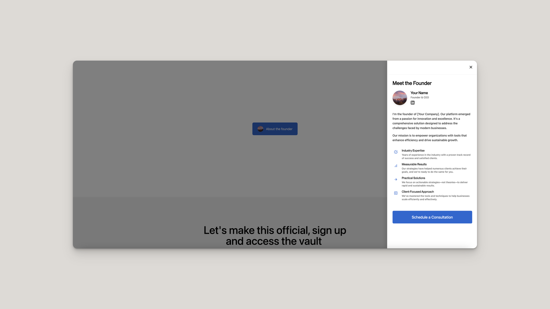
Profile Button Widget
The Profile Button Widget creates an interactive button that opens a side panel with detailed profile information. When a user clicks the button, a panel slides in from the right side of the screen with a smooth animation, displaying profile content with an elegant layout.
HTML Structure
The widget consists of two main components:
- The main container profileWidgetWrapper holds all widget elements
- The button profileButtonUnique that users click to open the panel
- The side panel sidePanel containing all profile information
The button includes:
- A circular image container profile-img-container
- Button text button-text
The side panel includes:
- A header with close button side-panel-header
- Content sections side-panel-section
- Profile info with image and details profile-info
- Feature items feature-item with icons
- Call-to-action button cta-button
CSS Styling
The CSS manages layout, transitions, and responsive behavior:
- Button styling:
- Uses flexbox for alignment and spacing
- Sets a primary color background ( #3366CC )
- Includes hover transitions for interactive feedback
- Note: The button has width: 100% by default, so when implementing it in your web design platform, you'll need to specify the container width on all viewports (desktop, tablet, mobile) to achieve your desired button width
- Side panel styling:
- Fixed positioning with z-index: 9999 to appear above other content
- Smooth transition using cubic-bezier easing
- Responsive width with max-width: 90vw
- Scrollable content with overflow-y: auto
- Feature items styling:
- Hover effects for interactive feedback
- Icon color transitions on hover
- Clean typography with proper spacing
- Overlay styling:
- Semi-transparent background ( rgba(0, 0, 0, 0.5) )
- Covers the entire viewport
- Transition for fade in/out effects
JavaScript Functionality
The JavaScript handles interactions and animations:
- Initialization:
- Creates the overlay element
- Attaches event listeners to buttons
- Cleans up any existing overlays to prevent conflicts
- Panel interactions:
- openPanel() function adds the open class to the side panel
- closePanel() function removes the open class
- Body scrolling is disabled when panel is open ( document.body.style.overflow = 'hidden' )
- Event listeners:
- Button click opens the panel
- Close button click closes the panel
- Overlay click closes the panel
- Escape key press closes the panel
Customization Options
You can easily customize various aspects of the widget:
- Colors: Modify the primary color ( #3366CC ) and hover color ( #254b99 )
- Button size: Adjust the min-height and padding properties
- Panel width: Change the width property on .side-panel
- Transition speed: Modify the transition duration values
- Content: Update text, images, and links to match your needs
- Features: Add or remove feature items as needed
- Social icons: Add additional social media links as required
Implementation Tips
To implement this widget successfully:
- Container sizing:
- The button spans 100% width of its container by default
- Set explicit width constraints on the container element in your design platform
- Specify these width constraints for all device breakpoints (desktop, tablet, mobile)
- Multiple widgets:
- If using multiple widgets on one page, ensure each has a unique ID
- Modify the JavaScript to target the specific widget instances
- Images:
- Replace the placeholder image URLs with your own images
- Ensure images are properly sized and optimized for web
- Use square images for profile pictures (they'll be cropped to circles)
- CMS integration:
- Create fields for all customizable content
- Map the dynamic content to the appropriate HTML elements
- Test thoroughly across different content lengths
- Accessibility:
- Ensure proper focus management when opening/closing the panel
- Add appropriate ARIA attributes for screen readers
- Test keyboard navigation within the panel

How to edit code using AI →
Resource Details:
Profile Button Widget adds an interactive "About me" button to your site. When clicked, a sleek side panel slides in from the right, displaying profile information, features, and a call-to-action button. Features smooth animations, responsive design, and keyboard accessibility. Simple HTML/CSS/JS implementation with customizable colors, content, and styling. Note that the button is 100% width by default, so container width should be specified for all device breakpoints.RetryClaude can make mistakes. Please double-check responses.

NO-ACCESS
Only for Desktop Users
This page is only available on desktop.
Please Log in on a desktop to gain access.