Member
Account Settings
Share AgencyGenius
Know someone who might benefit from AgencyGenius? We'd love it if you shared our platform with your networking group!
Documentation
Step 1: Add HTML, Css & JavaScript
 <div id="skeleton-example">
 <!-- Content section with skeleton loading -->
 <div class="content-section dark-theme">
 <h1 data-content-skeleton="primary" class="content-heading small-text">Skeleton loaders improve perceived performance by showing placeholder elements while content loads. This pattern has become a standard practice in modern web design to create more engaging loading states.</h1>
 </div>
 </div>
 /* All styles scoped inside a wrapper ID to prevent conflicts */
 #skeleton-example {
 width: 100%;
 height: 100%;
 }

 /* Section styling */
 #skeleton-example .content-section {
 display: flex;
 flex-flow: column;
 justify-content: center;
 align-items: center;
 width: 100%;
 min-height: 100vh;
 padding: 1em;
 }

 /* Mobile responsive section height */
 @media (max-width: 768px) {
 #skeleton-example .content-section {
 min-height: auto;
 padding: 3em 1em;
 }
 }

 #skeleton-example .content-section.dark-theme {
 color: #ffffff !important;
 background-color: transparent;
 }

 /* Heading styling */
 #skeleton-example .content-heading {
 letter-spacing: -.03em;
 text-transform: uppercase;
 margin: 0;
 font-family: monospace, Arial, sans-serif;
 font-weight: 400;
 position: relative;
 color: #ffffff !important;
 }

 #skeleton-example .content-heading.small-text {
 max-width: 25em;
 font-size: 2.5em;
 line-height: 1.1;
 }

 /* Mobile responsive styles */
 @media (max-width: 768px) {
 #skeleton-example .content-heading.small-text {
 font-size: 2em;
 max-width: 100%;
 }
 }

 /* Small mobile devices */
 @media (max-width: 480px) {
 #skeleton-example .content-heading.small-text {
 font-size: 1.8em;
 }
 }

 /* Theme colors */
 #skeleton-example [data-content-skeleton="primary"] {
 --skeleton-color-base: #404c59;
 --skeleton-color-pulse: #5d6b7a;
 }

 /* Hide content immediately to prevent flash */
 #skeleton-example [data-content-skeleton] {
 visibility: hidden;
 }

 /* Hide text lines initially */
 #skeleton-example [data-content-skeleton] .text-line {
 visibility: hidden;
 }

 /* When revealed, make text visible */
 #skeleton-example [data-content-skeleton] .text-line.reveal {
 visibility: visible;
 }

 /* Text line wrapper */
 #skeleton-example .text-line-wrapper {
 position: relative;
 display: block;
 }

 /* Skeleton placeholder */
 #skeleton-example .skeleton-placeholder {
 position: absolute;
 top: 50%;
 transform: translate(0px, -50%);
 left: 0px;
 width: 100%;
 height: 80%;
 border-radius: 0.25rem;
 z-index: 1;
 background-color: var(--skeleton-color-base);
 opacity: 1;
 }

 /* Animations */
 @keyframes pulseAnimation {
 0% { background-color: var(--skeleton-color-base); }
 50% { background-color: var(--skeleton-color-pulse); }
 100% { background-color: var(--skeleton-color-base); }
 }

 @keyframes vanishAnimation {
 0% { opacity: 1; }
 100% { opacity: 0; visibility: hidden; }
 }
 // Initialize on DOM content loaded
 document.addEventListener("DOMContentLoaded", () => {
 document.fonts.ready.then(initSkeletonLoader);
 });

 // Initialize skeleton loader
 function initSkeletonLoader() {
 const target = document.querySelector('#skeleton-example [data-content-skeleton]');

 if (!target) return;

 // Split text into lines
 splitTextIntoLines(target);

 // Create and animate skeletons
 animateSkeletons(target);
 }

 // Split text into lines
 function splitTextIntoLines(element) {
 // Store original content
 const originalText = element.innerHTML;

 // Create a temp element to measure text width
 const tempEl = document.createElement('div');
 tempEl.style.position = 'absolute';
 tempEl.style.visibility = 'hidden';
 tempEl.style.whiteSpace = 'nowrap';
 tempEl.style.font = window.getComputedStyle(element).font;
 tempEl.style.fontSize = window.getComputedStyle(element).fontSize;
 document.body.appendChild(tempEl);

 // Get max width
 const maxWidth = element.getBoundingClientRect().width;

 // Split into words
 const words = originalText.split(' ');
 let currentLine = '';
 let result = '';

 // Process each word
 words.forEach((word, i) => {
 tempEl.textContent = currentLine + word;

 if (tempEl.getBoundingClientRect().width > maxWidth && currentLine !== '') {
 // Add line wrapper
 result += `<div class="text-line-wrapper"><div class="text-line">${currentLine.trim()}</div></div>`;
 currentLine = word + ' ';
 } else {
 currentLine += word + ' ';
 }

 // Add last line
 if (i === words.length - 1 && currentLine) {
 result += `<div class="text-line-wrapper"><div class="text-line">${currentLine.trim()}</div></div>`;
 }
 });

 // Clean up and update content
 document.body.removeChild(tempEl);
 element.innerHTML = result;

 // Make the parent element visible again now that lines are properly set up
 element.style.visibility = 'visible';
 }

 // Create and animate skeleton placeholders
 function animateSkeletons(element) {
 const lineWrappers = element.querySelectorAll('.text-line-wrapper');

 // Add skeleton placeholder to each line
 lineWrappers.forEach((wrapper, i) => {
 const placeholder = document.createElement('div');
 placeholder.classList.add('skeleton-placeholder');
 wrapper.appendChild(placeholder);

 const textElement = wrapper.querySelector('.text-line');

 // Start animation with delay based on line index
 setTimeout(() => {
 let pulseCount = 0;
 const maxPulses = 2;

 // Pulse animation function
 function doPulse() {
 placeholder.style.animation = 'pulseAnimation 0.3s ease-in-out';

 placeholder.addEventListener('animationend', () => {
 placeholder.style.animation = '';
 pulseCount++;

 if (pulseCount <= maxPulses) {
 // Continue pulsing
 setTimeout(doPulse, 10);
 } else {
 // Reveal text and fade out placeholder
 textElement.classList.add('reveal');
 placeholder.style.animation = 'vanishAnimation 0.3s ease-in-out forwards';
 }
 }, { once: true });
 }

 // Start pulse animation
 doPulse();
 }, i * 50); // Stagger each line by 50ms
 });
 }
 <div id="snippet-crqyghhx">
 <!-- HTML SECTION START -->
 <div id="skeleton-example">
 <!-- Content section with skeleton loading -->
 <div class="content-section dark-theme">
 <h1 data-content-skeleton="primary" class="content-heading small-text">Skeleton loaders improve perceived performance by showing placeholder elements while content loads. This pattern has become a standard practice in modern web design to create more engaging loading states.</h1>
 </div>
 </div>
 <!-- HTML SECTION END -->

 <!-- CSS SECTION START -->
 <style>
 /* All styles scoped inside a wrapper ID to prevent conflicts */
 #skeleton-example {
 width: 100%;
 height: 100%;
 }

 /* Section styling */
 #skeleton-example .content-section {
 display: flex;
 flex-flow: column;
 justify-content: center;
 align-items: center;
 width: 100%;
 min-height: 100vh;
 padding: 1em;
 }

 /* Mobile responsive section height */
 @media (max-width: 768px) {
 #skeleton-example .content-section {
 min-height: auto;
 padding: 3em 1em;
 }
 }

 #skeleton-example .content-section.dark-theme {
 color: #ffffff !important;
 background-color: transparent;
 }

 /* Heading styling */
 #skeleton-example .content-heading {
 letter-spacing: -.03em;
 text-transform: uppercase;
 margin: 0;
 font-family: monospace, Arial, sans-serif;
 font-weight: 400;
 position: relative;
 color: #ffffff !important;
 }

 #skeleton-example .content-heading.small-text {
 max-width: 25em;
 font-size: 2.5em;
 line-height: 1.1;
 }

 /* Mobile responsive styles */
 @media (max-width: 768px) {
 #skeleton-example .content-heading.small-text {
 font-size: 2em;
 max-width: 100%;
 }
 }

 /* Small mobile devices */
 @media (max-width: 480px) {
 #skeleton-example .content-heading.small-text {
 font-size: 1.8em;
 }
 }

 /* Theme colors */
 #skeleton-example [data-content-skeleton="primary"] {
 --skeleton-color-base: #404c59;
 --skeleton-color-pulse: #5d6b7a;
 }

 /* Hide content immediately to prevent flash */
 #skeleton-example [data-content-skeleton] {
 visibility: hidden;
 }

 /* Hide text lines initially */
 #skeleton-example [data-content-skeleton] .text-line {
 visibility: hidden;
 }

 /* When revealed, make text visible */
 #skeleton-example [data-content-skeleton] .text-line.reveal {
 visibility: visible;
 }

 /* Text line wrapper */
 #skeleton-example .text-line-wrapper {
 position: relative;
 display: block;
 }

 /* Skeleton placeholder */
 #skeleton-example .skeleton-placeholder {
 position: absolute;
 top: 50%;
 transform: translate(0px, -50%);
 left: 0px;
 width: 100%;
 height: 80%;
 border-radius: 0.25rem;
 z-index: 1;
 background-color: var(--skeleton-color-base);
 opacity: 1;
 }

 /* Animations */
 @keyframes pulseAnimation {
 0% { background-color: var(--skeleton-color-base); }
 50% { background-color: var(--skeleton-color-pulse); }
 100% { background-color: var(--skeleton-color-base); }
 }

 @keyframes vanishAnimation {
 0% { opacity: 1; }
 100% { opacity: 0; visibility: hidden; }
 }
 </style>
 <!-- CSS SECTION END -->

 <!-- JAVASCRIPT SECTION START -->
 <script>
 // Initialize on DOM content loaded
 document.addEventListener("DOMContentLoaded", () => {
 document.fonts.ready.then(initSkeletonLoader);
 });

 // Initialize skeleton loader
 function initSkeletonLoader() {
 const target = document.querySelector('#skeleton-example [data-content-skeleton]');

 if (!target) return;

 // Split text into lines
 splitTextIntoLines(target);

 // Create and animate skeletons
 animateSkeletons(target);
 }

 // Split text into lines
 function splitTextIntoLines(element) {
 // Store original content
 const originalText = element.innerHTML;

 // Create a temp element to measure text width
 const tempEl = document.createElement('div');
 tempEl.style.position = 'absolute';
 tempEl.style.visibility = 'hidden';
 tempEl.style.whiteSpace = 'nowrap';
 tempEl.style.font = window.getComputedStyle(element).font;
 tempEl.style.fontSize = window.getComputedStyle(element).fontSize;
 document.body.appendChild(tempEl);

 // Get max width
 const maxWidth = element.getBoundingClientRect().width;

 // Split into words
 const words = originalText.split(' ');
 let currentLine = '';
 let result = '';

 // Process each word
 words.forEach((word, i) => {
 tempEl.textContent = currentLine + word;

 if (tempEl.getBoundingClientRect().width > maxWidth && currentLine !== '') {
 // Add line wrapper
 result += `<div class="text-line-wrapper"><div class="text-line">${currentLine.trim()}</div></div>`;
 currentLine = word + ' ';
 } else {
 currentLine += word + ' ';
 }

 // Add last line
 if (i === words.length - 1 && currentLine) {
 result += `<div class="text-line-wrapper"><div class="text-line">${currentLine.trim()}</div></div>`;
 }
 });

 // Clean up and update content
 document.body.removeChild(tempEl);
 element.innerHTML = result;

 // Make the parent element visible again now that lines are properly set up
 element.style.visibility = 'visible';
 }

 // Create and animate skeleton placeholders
 function animateSkeletons(element) {
 const lineWrappers = element.querySelectorAll('.text-line-wrapper');

 // Add skeleton placeholder to each line
 lineWrappers.forEach((wrapper, i) => {
 const placeholder = document.createElement('div');
 placeholder.classList.add('skeleton-placeholder');
 wrapper.appendChild(placeholder);

 const textElement = wrapper.querySelector('.text-line');

 // Start animation with delay based on line index
 setTimeout(() => {
 let pulseCount = 0;
 const maxPulses = 2;

 // Pulse animation function
 function doPulse() {
 placeholder.style.animation = 'pulseAnimation 0.3s ease-in-out';

 placeholder.addEventListener('animationend', () => {
 placeholder.style.animation = '';
 pulseCount++;

 if (pulseCount <= maxPulses) {
 // Continue pulsing
 setTimeout(doPulse, 10);
 } else {
 // Reveal text and fade out placeholder
 textElement.classList.add('reveal');
 placeholder.style.animation = 'vanishAnimation 0.3s ease-in-out forwards';
 }
 }, { once: true });
 }

 // Start pulse animation
 doPulse();
 }, i * 50); // Stagger each line by 50ms
 });
 }
 </script>
 <!-- JAVASCRIPT SECTION END -->
 </div>
Introduction
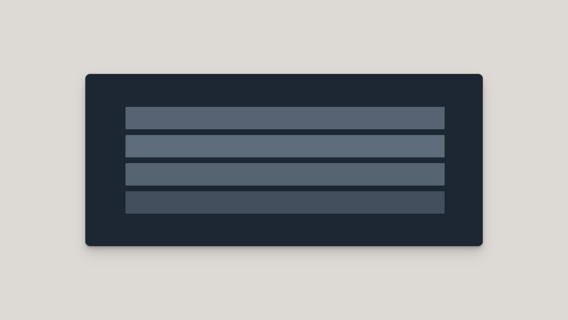
The Skeleton Loader provides a polished loading experience with animated placeholders that pulse until content is ready. This creates a more engaging user experience than traditional spinners or blank screens, improving perceived performance.
Implementation
This skeleton loader uses attribute-based configuration with CSS variables for theming and vanilla JavaScript for animation control. When content is loading, skeleton placeholders appear and pulse before fading away to reveal the actual content once it's ready.
HTML Structure
Use the following HTML structure:
- The main container should have a unique ID like skeleton-example
- Add a section with an appropriate theme class, such as content-section dark-theme
- Use heading elements with the data-content-skeleton attribute to enable skeleton loading
- Assign a value to data-content-skeleton to define the color theme (e.g., primary )
- Apply the content-heading class to style the text appropriately
- Add small-text class for smaller font sizing if needed
CSS Configuration
The CSS handles styling, animations, and theme colors:
- Define container and section styling:
- Use flex for proper content centering
- Set appropriate dimensions with width: 100%
- Control height with min-height property
- Create theme variables with CSS custom properties:
- --skeleton-color-base : The base color of skeleton placeholders
- --skeleton-color-pulse : The color skeleton placeholders pulse to
- Define animations with @keyframes
:
- pulseAnimation : Controls the color pulsing effect
- vanishAnimation : Handles the fade-out transition
- Create responsive styling with media queries for mobile devices
JavaScript Functionality
The JavaScript implements the skeleton loading behavior:
- initSkeletonLoader() : Main initialization function that starts the process
- splitTextIntoLines()
: Analyzes text content and splits it into lines for skeleton animation
- Detects natural line breaks based on container width
- Creates wrapper elements for each text line
- Ensures text is hidden until ready to display
- animateSkeletons()
: Handles the actual animation sequence
- Creates placeholder elements for each line
- Implements the pulse animation with the correct timing
- Manages the transition from skeleton to actual content
- Applies staggered animation timing between lines
Animation Process
The skeleton loader follows this sequence:
- Text is initially hidden via CSS to prevent flash of content
- Text is split into individual lines based on container width
- Skeleton placeholders are added for each line
- When in view, each line's placeholder pulses 3 times
- After pulsing, text is revealed as the placeholder fades out
- Lines animate in sequence with a subtle stagger effect (50ms delay)
Customization Options
You can customize the skeleton loader in various ways:
- Color themes: Modify the --skeleton-color-base and --skeleton-color-pulse variables
- Animation timing: Adjust the animation durations in both CSS and JavaScript:
- Pulse speed: Change 0.3s in the pulseAnimation duration
- Fade-out speed: Modify 0.3s in the vanishAnimation duration
- Line stagger: Change the 50ms delay in animateSkeletons()
- Pulse count: Change maxPulses value (default: 2) to control how many times the skeleton pulses
- Skeleton shape: Adjust the height and border-radius of the skeleton-placeholder class
- Responsive behavior: Modify the media query breakpoints and style adjustments
Browser Compatibility
The skeleton loader is compatible with all modern browsers, using standard features:
- CSS animations for visual effects
- Intersection Observer API for detecting when elements are in view
- CSS custom properties for theming
- No external dependencies or libraries required

How to edit code using AI →
Resource Details:
Skeleton Loader Widget creates visually appealing content placeholders for a smoother loading experience. It displays animated, pulsing placeholders that match the layout of your content before revealing the actual text. Features line-by-line animation with staggered timing, customizable colors, and responsive design for all screen sizes. Built with vanilla JavaScript and CSS animations, it improves perceived performance without any dependencies.RetryClaude can make mistakes. Please double-check responses.

NO-ACCESS
Only for Desktop Users
This page is only available on desktop.
Please Log in on a desktop to gain access.